

Understanding the Story
The World Health Organization estimates that 1.3 billion people live with some form of visual impairment worldwide.
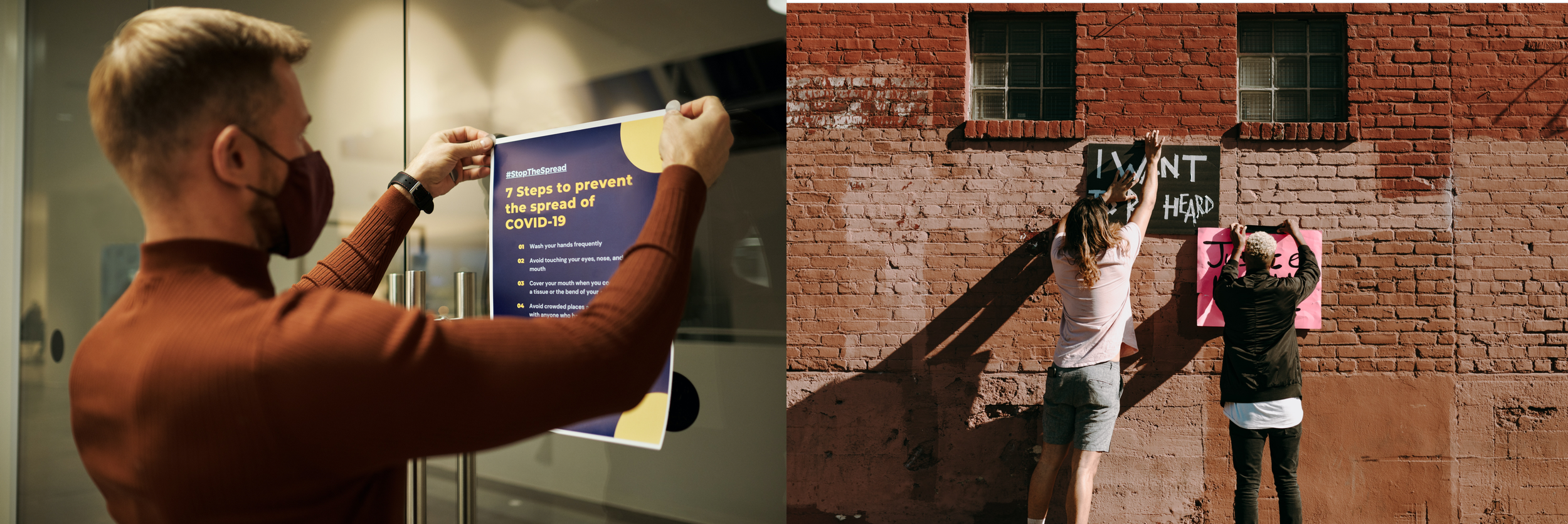
I see fancy posters and notices posted on hallways and elevators, trying to catch our attention. But, no matter how well-designed it is, it’s limited to those who can see and read. The content can not be delivered or accessed by those who do not or cannot see it. It got me curious about what I could do with this thought under the constraints of this project. So I started my research with a question.
Can I create an equivalent experience with type for those who can not see?
TOUCH
For the blind, it doesn't matter if the type chosen for a poster looks nice for it to be read. Braille is used so the blind can read and is usually used on public signs. Why not on posters? or cards? how can I expand the daily usage of braille and create a mutual experience for more people? This project proposes a solution to all of these questions.
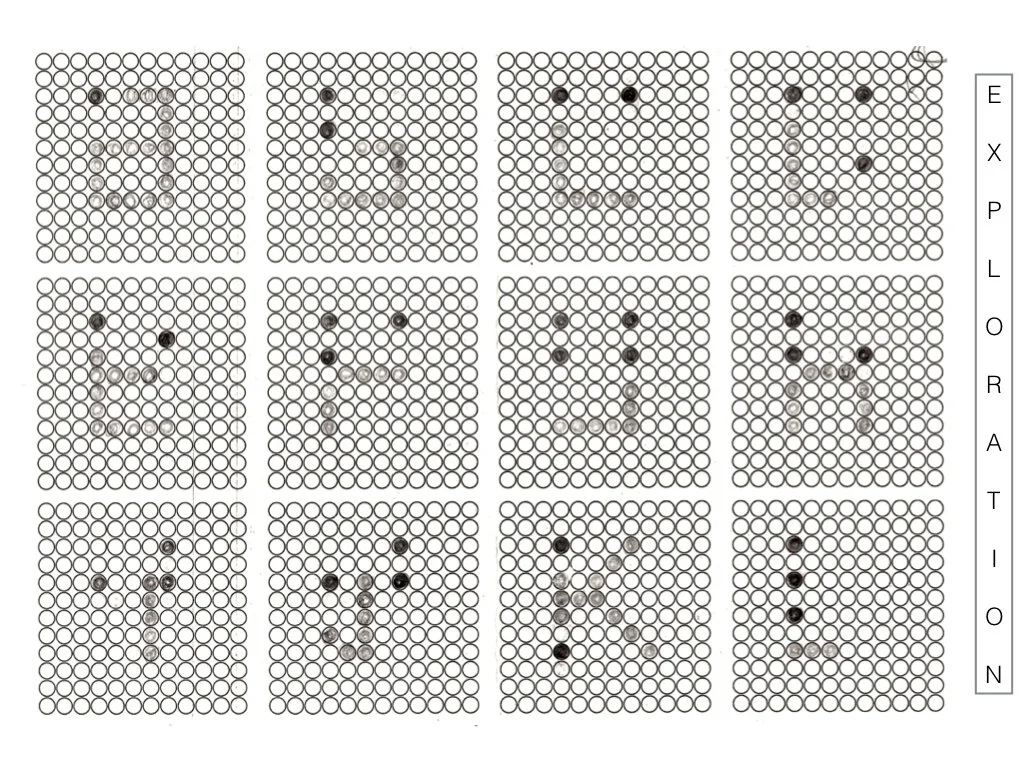
For this academic project, I was challenged to create a Modular Type by only using a 12x12 grid.
Problem Space
Current Situation
Text is one of the main ways we transport information to the reader’s mind. As designers, we put a lot of thought into deciding the right typeface (shape, use, visibility and aesthetics..etc.)
Those who are blind or partially sighted cannot receive the same experience with everyday things around us.
Existing Solution:
Braille signs serve a purpose for people who are blind and only for the limited number of people who can read Braille. Braille is currently most commonly seen as(limited to) signage.
Timeline - Summer 2019, 2 Weeks
My Role - UX DESIGNER
Practices - Type Design, Human-Centered Design, Accessibility Design, UX Research
Tools Used- Pen & Paper, Fontstruct, Adobe Photoshop
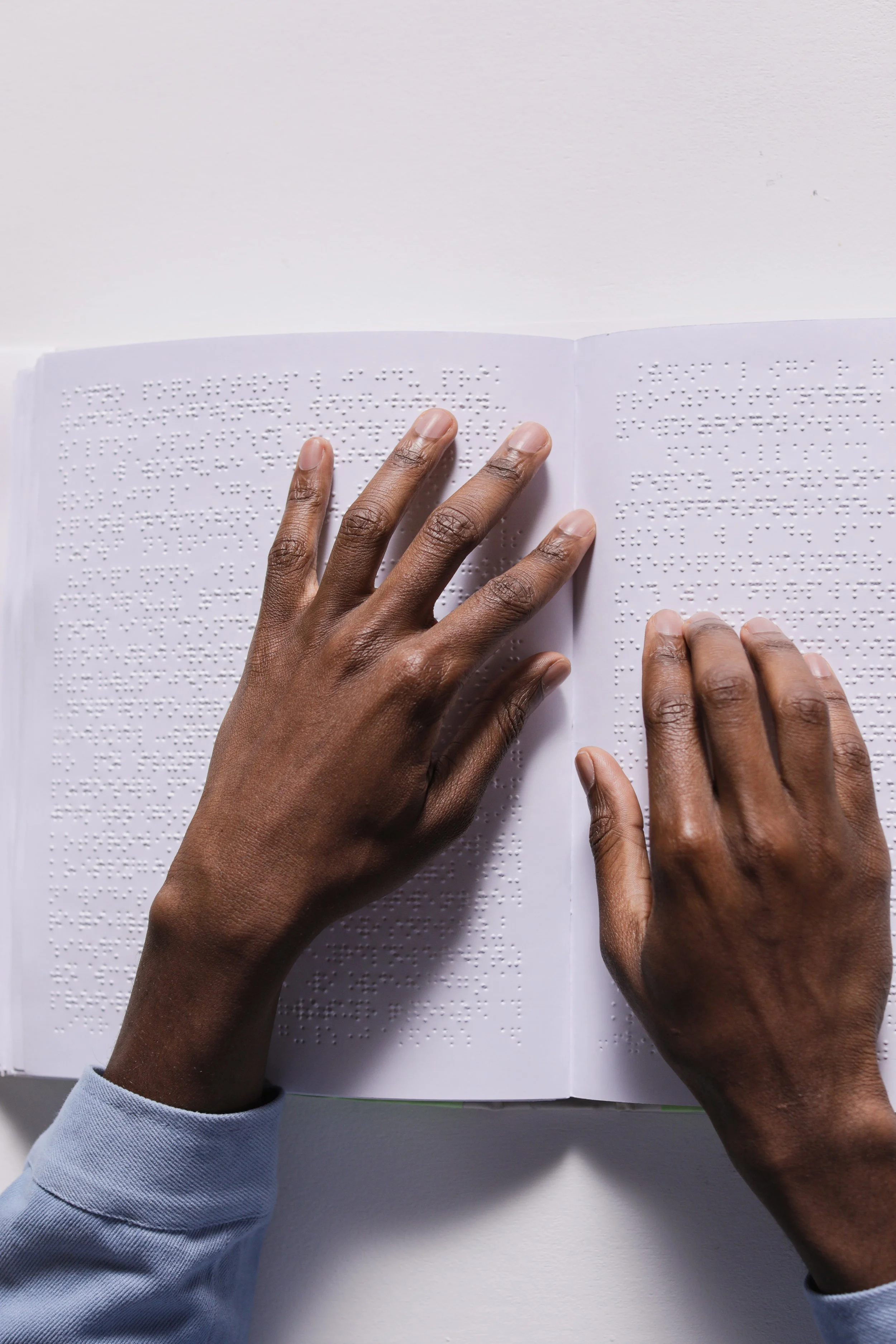
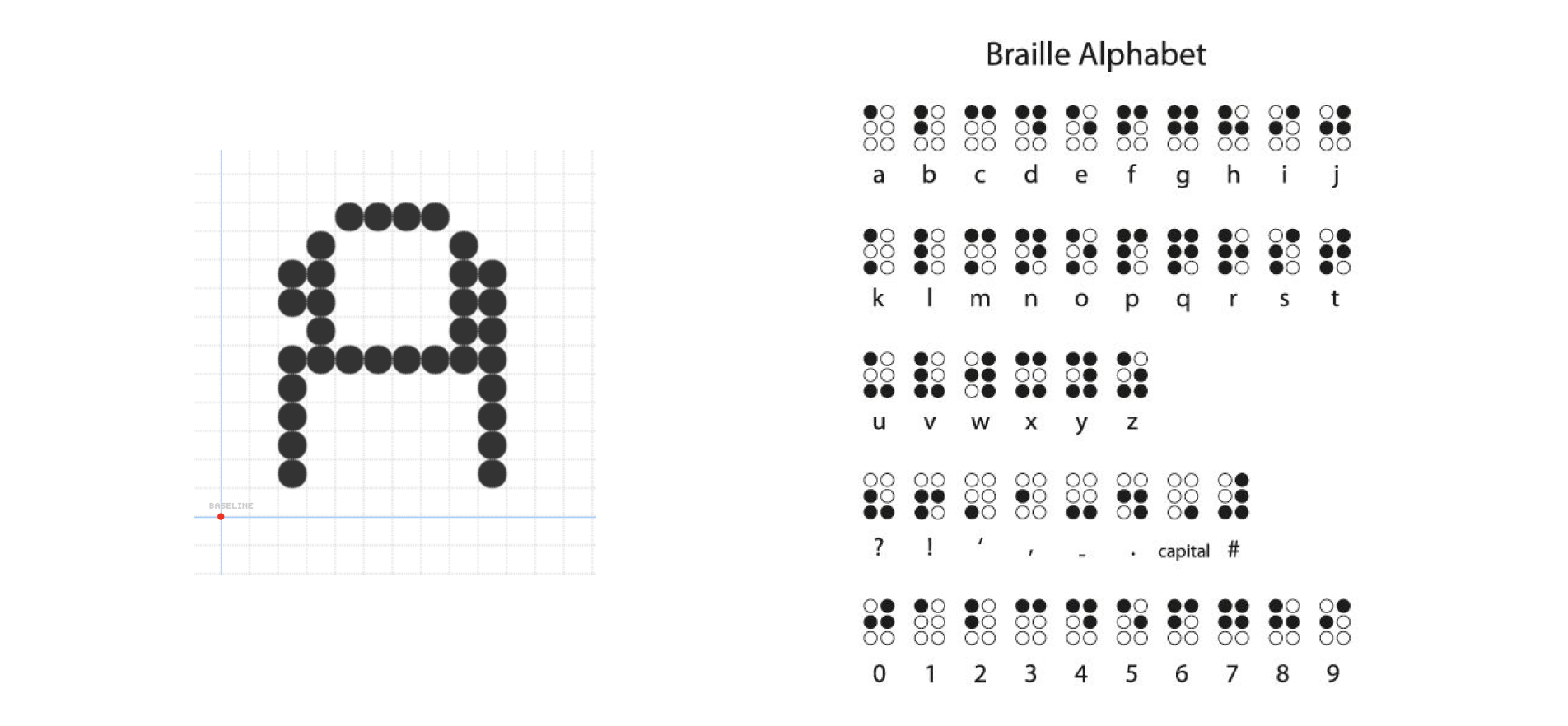
What is Braille?
Braille is a system of raised dots that can be read with the fingers by people who are blind or who have low vision. It provides a means of literacy for all, but those who are not blind can only read braille with their eyes and usually can’t understand.
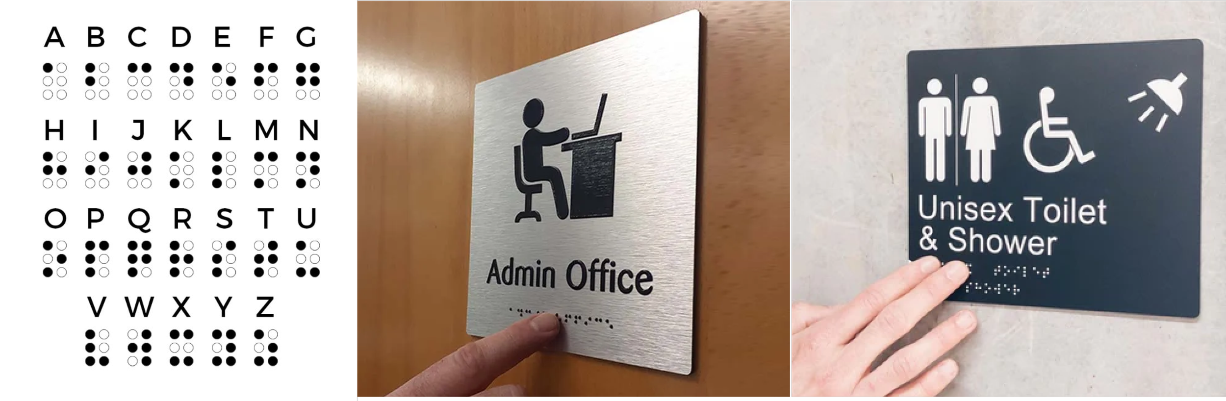
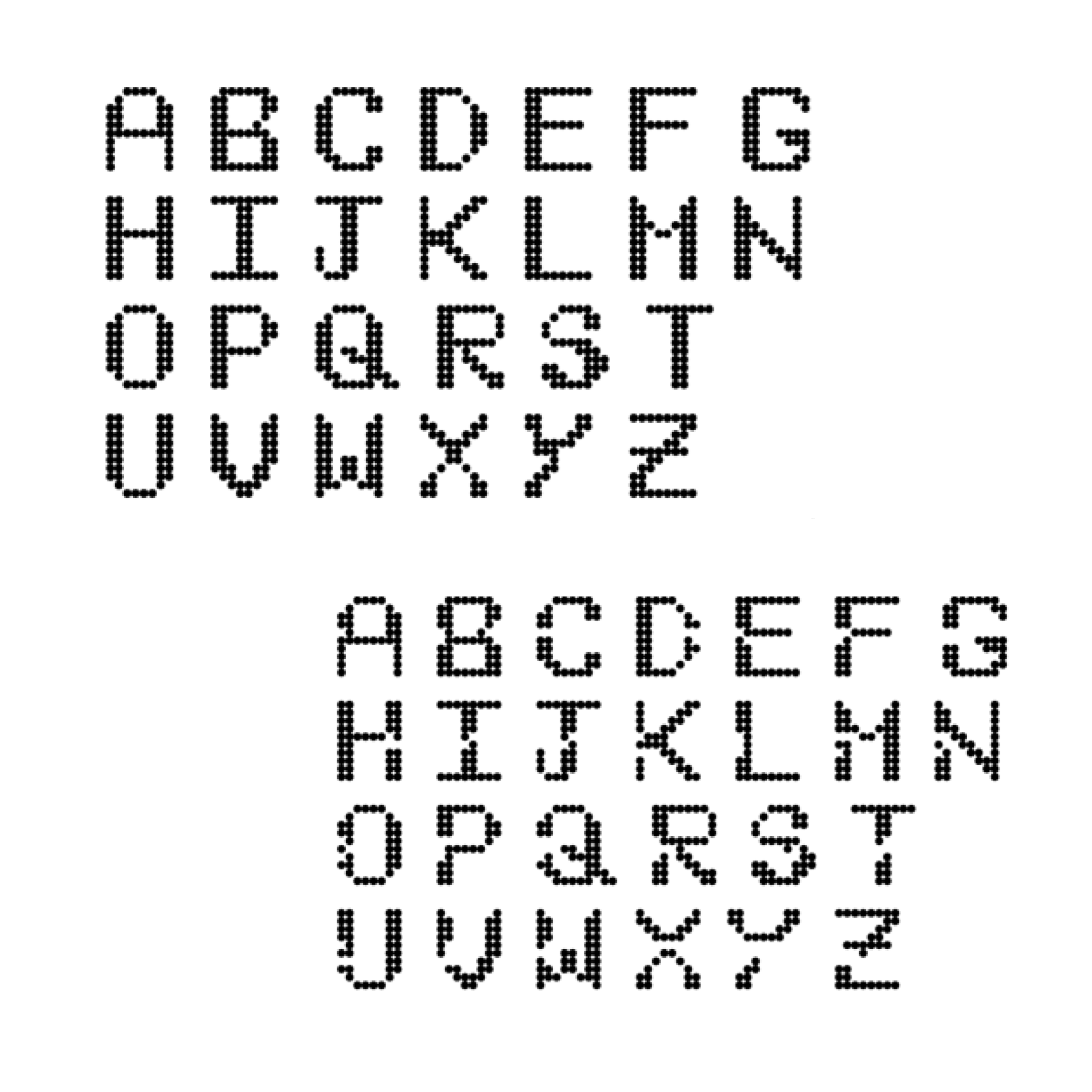
Braille Alphabet in Use
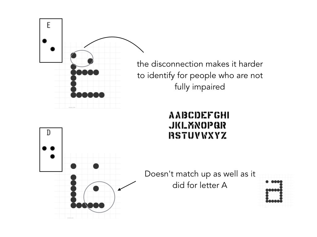
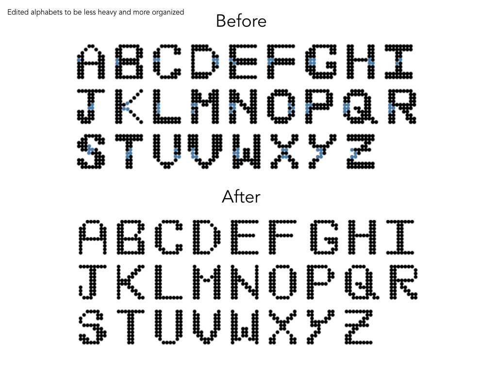
Sketches and Iterations
Attempts to combine the visual and tactile(braille) Alphabet.
SYSTEM
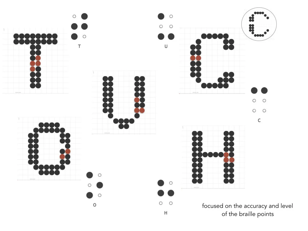
Placing of Dots
I considered making it easily visible to those who can see, as well as keeping the design simple and visible from far, while also maintaining the braille alphabet dots in accurate positions.
Outcome

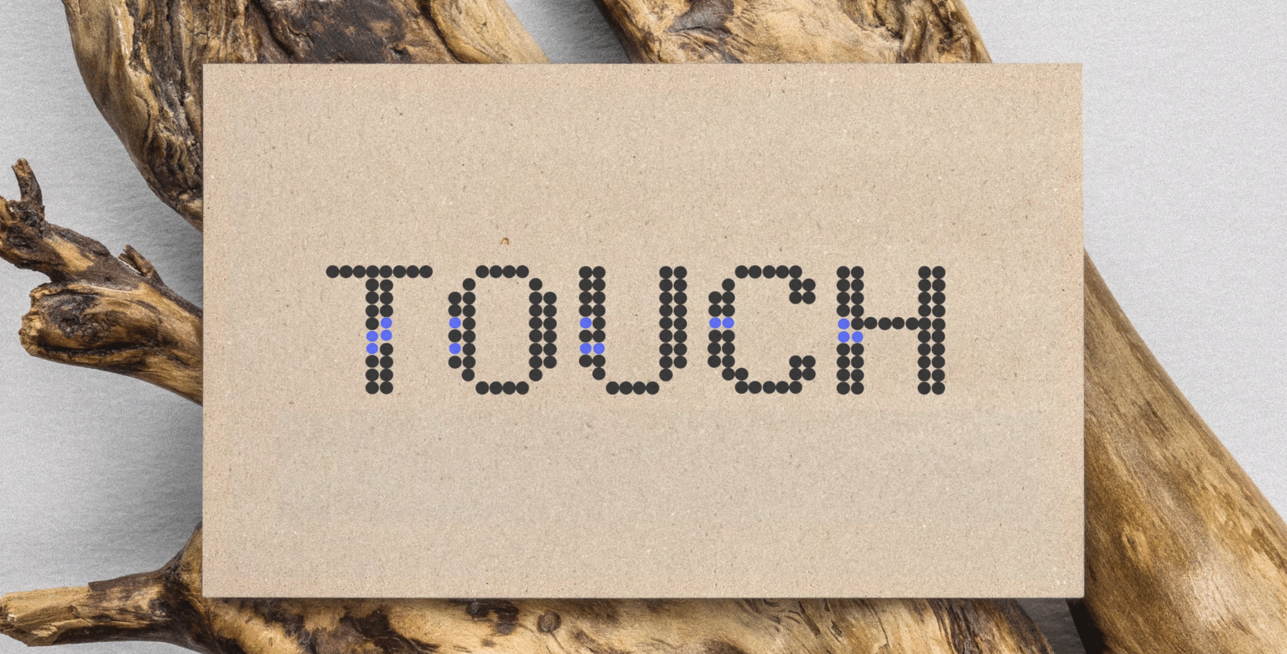
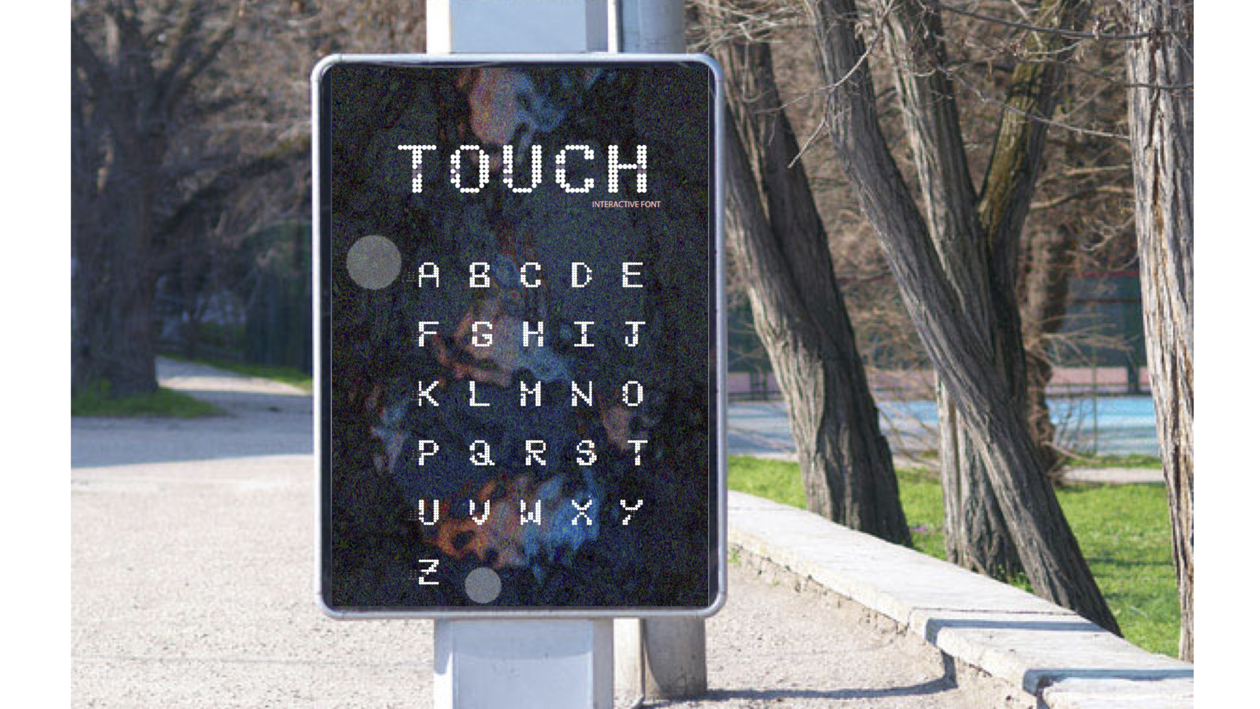
Touch Font printed out for public use (posters) and personal use (cards, letters from a loved one)
One thing to consider would be that an extra step is needed to emboss the dots.
FINAL THOUGHTS
Takeaway
LESSONS LEARNED💁♀️
Working under the constraints of only using the 12x12 grid opened a space for me to play with the idea of designing a font/poster to become more interactive and serve a greater purpose. It was a meaningful project because it allowed me to be more critical and create a space for those who are sometimes left out of the experience. I hope this font will raise more awareness, help people learn and read braille, and provide a more diverse experience in public spaces for those who use braille to read.