

Learning Experience Platform (LXP)
Timeline - November 2022 - January 2022
My Role - UX DESIGNER (worked remotely)
Tools Used - Figma, Adobe Illustrator
What is the LXP? Who is it for?
Vivo Team Development is a company specializing in training Teams while Developing Leaders. I worked on enhancing their LXP, which is the resource hub for all participants during the program.
Phase 1: Enhance the UI
Match Vivo team brand guidelines.
Identify issues in functionality.
Phase 2: Increase interactivity and functionality.
completion tracking for better analytics
Increase time spent on LXP for participants.
What do Participants do on the LXP?
Users are tasked to log-in weekly to:
Download the Hot Sheet
Complete the Pre-Session Task
Watch Videos + Answer the Poll
Ask Questions in the Coach Connect
Phase 1: Simple Updates, Get to know the LXP
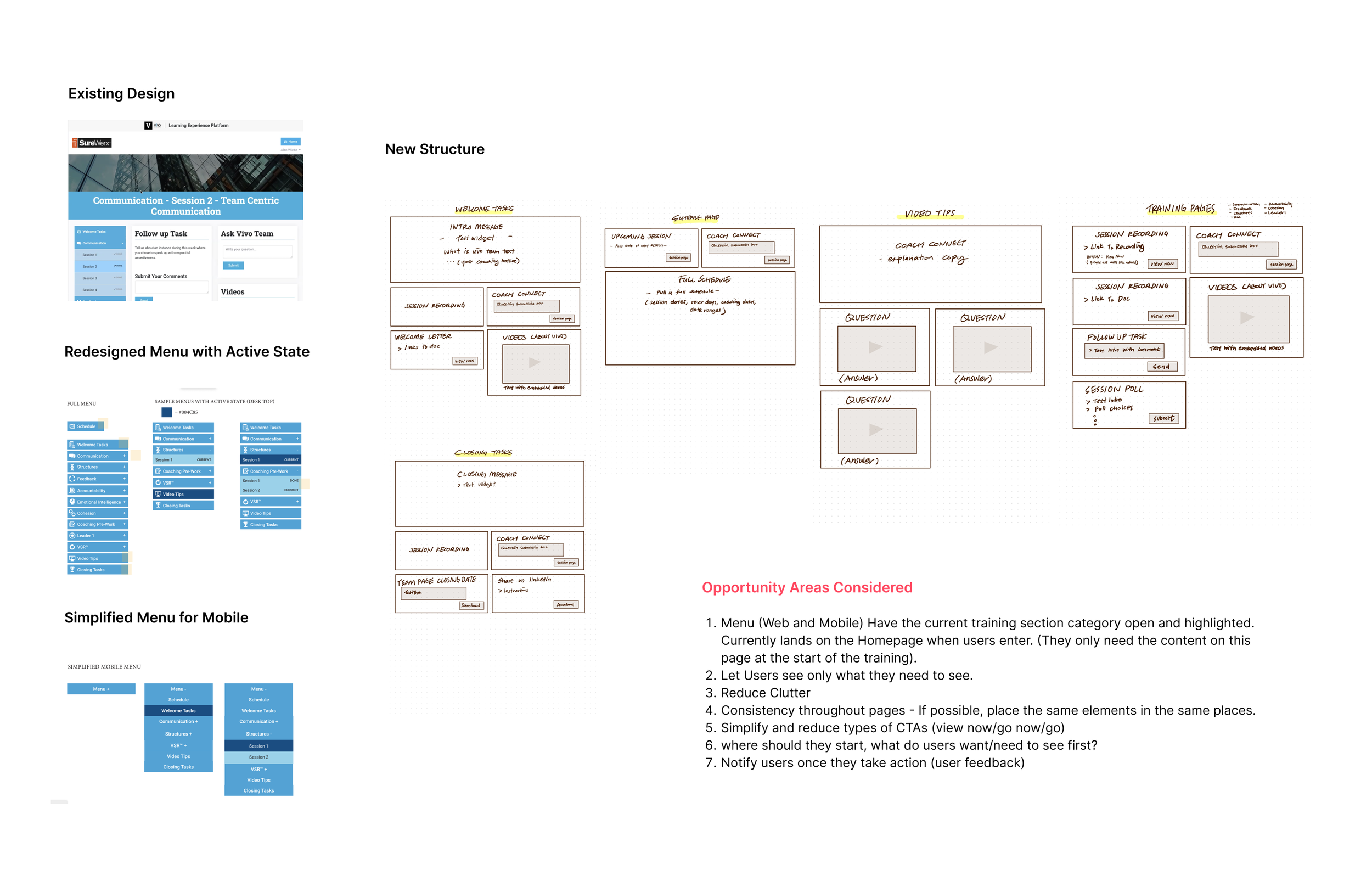
The Process
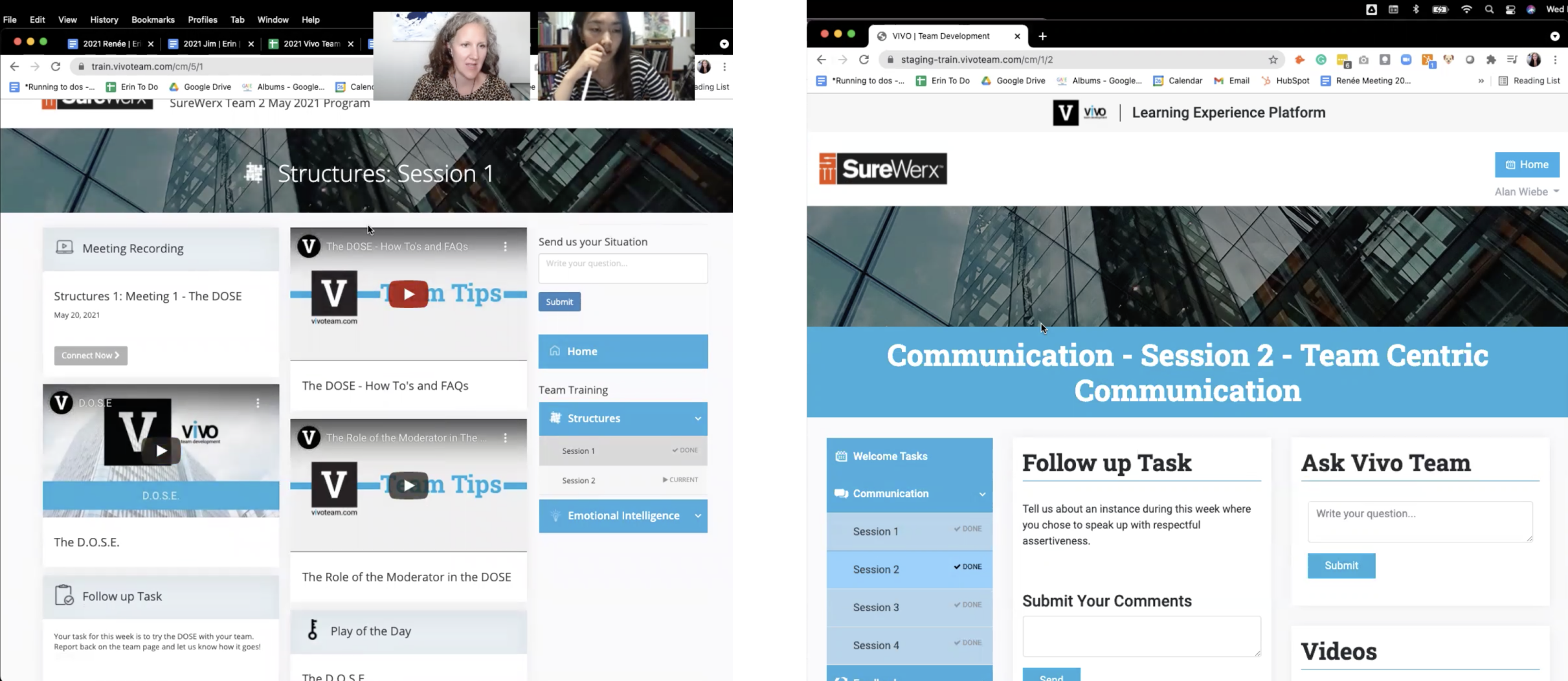
This was the original design I was handed off with, The left was the existing LXP Platform at the time, and the right was the updated design and direction they were hoping for me to carry on with.
My job for phase 1 was more about quick fixes, refining the updated design, and identifying problems for the next step.
My Observations
The existing design did not consider the user’s cognitive load.
The trainers need to manually track where each participant is in training to keep them up to date. ( a lot of explaining / communication through other platforms).
Unnecessary use of images/sections.
Inconsistent use of icons and font styles.
No guidelines for design in place
The Content on the page is crowded and needs to be more organized and to be more consumable.
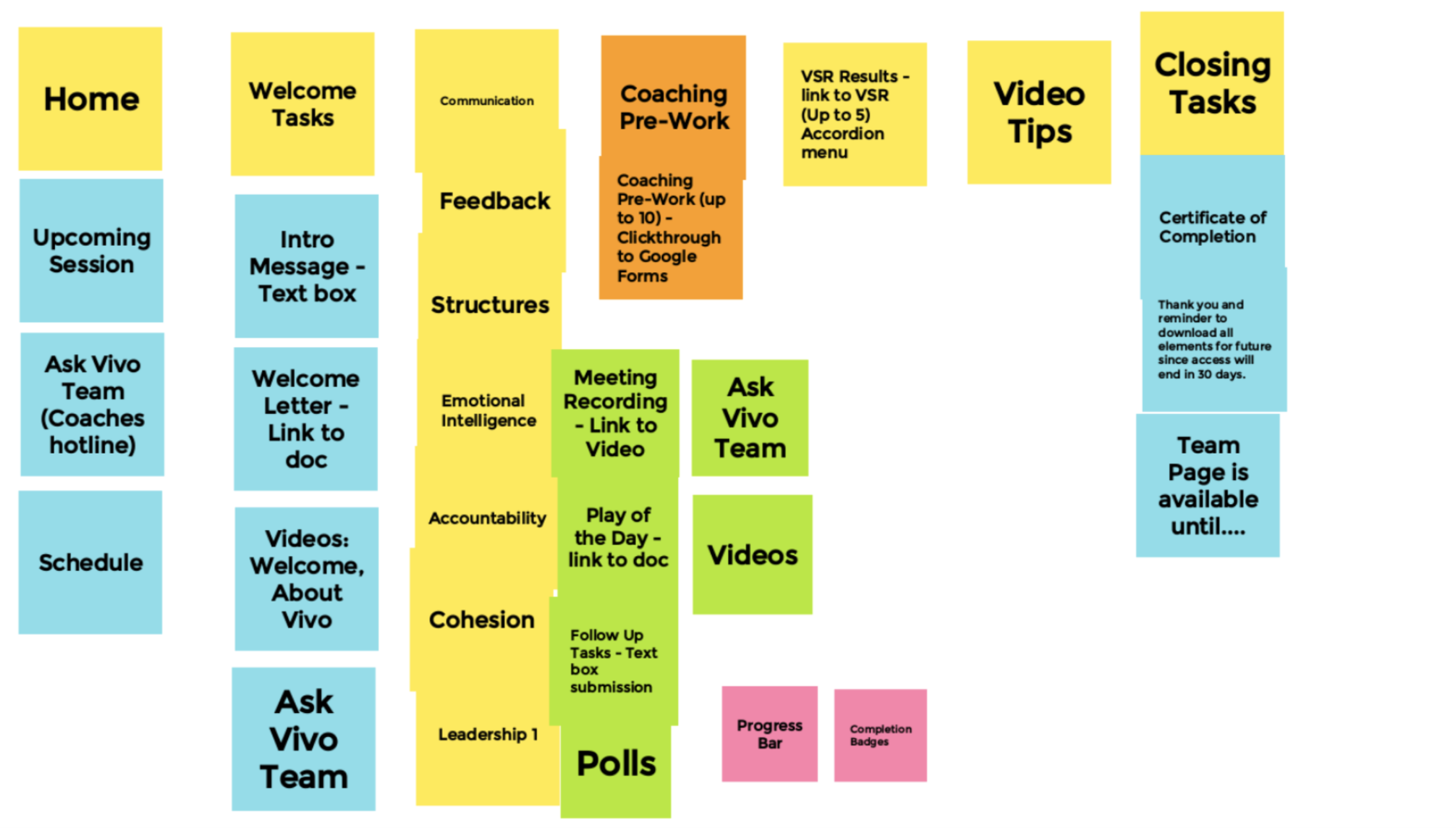
Content Grouping
The team and I sorted out the content for each page through a jam board session.
Sketching out a content structure for pages
This allowed me to roughly visualize and organize the content that needed to be present in each of the pages
Steps Taken
Brand Guidelines
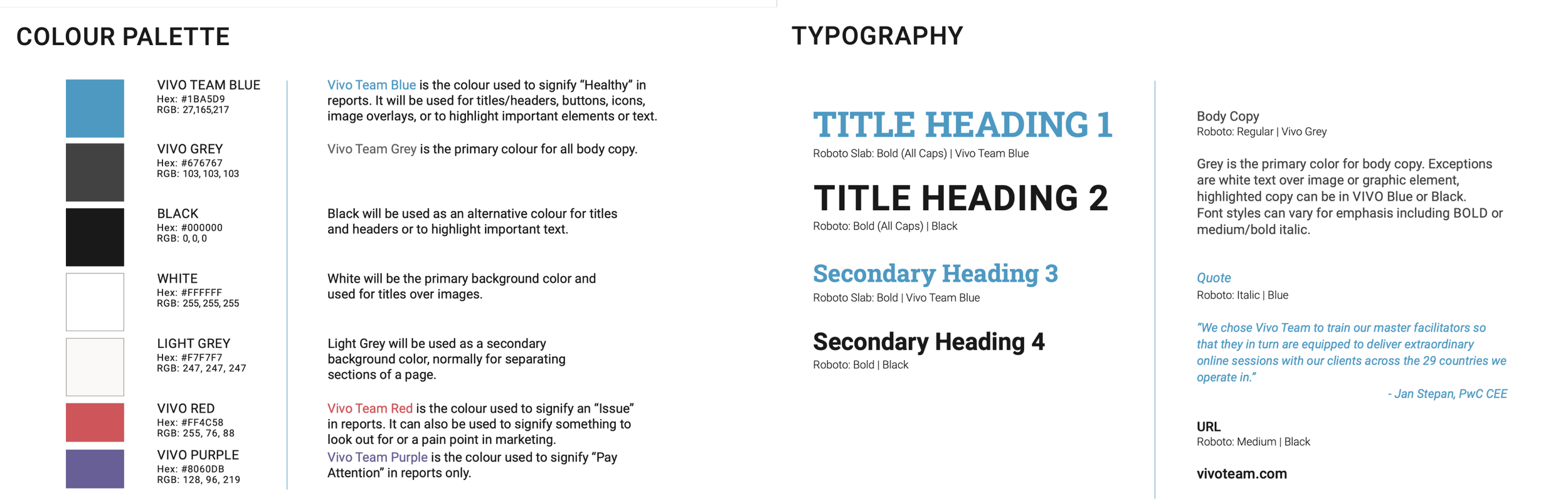
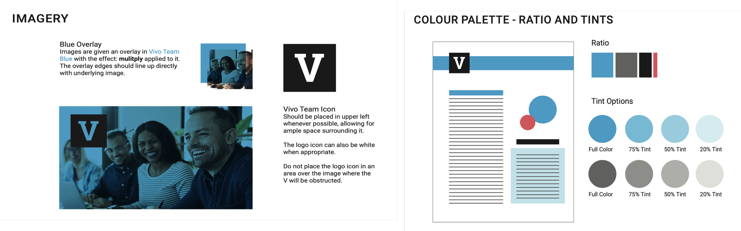
I believe users are highly motivated to use products that look better. Since it wasn’t about designing what I want, I focused on what is needed and utilized my skills to build out a simple and consistent design to improve usability under the given guideline. That did not limit me from putting my ideas out and suggesting ideas to develop and change (if needed) their current design system. This led me to work on a Design System for Vivo Team (a new separate project).
I presented my research and findings during one of our weekly LXP meetings.
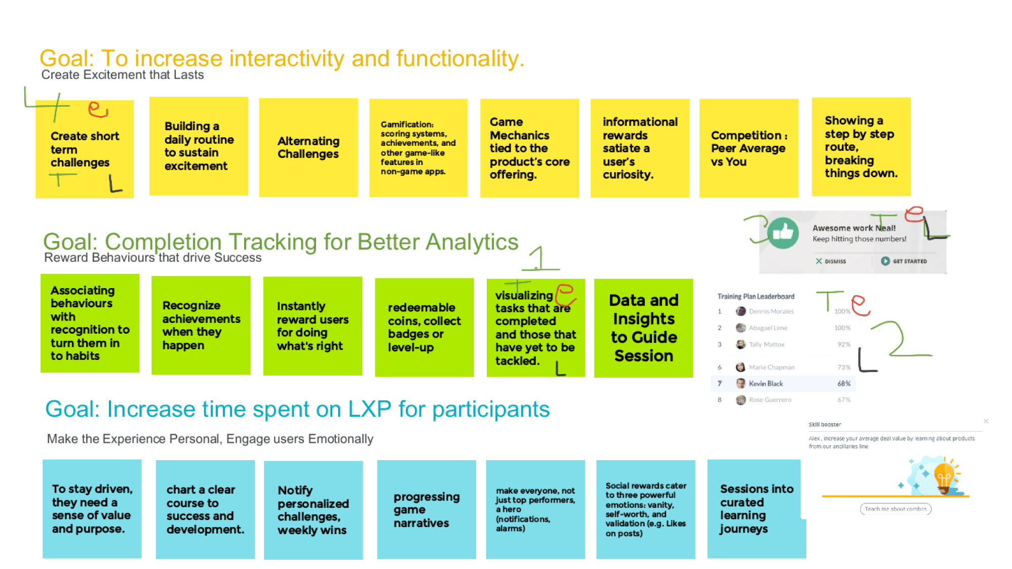
I organized my findings into the chart below: Ways/Options/Tasks to help us reach the goals we had set previously as a group. We then discussed and voted on what we wanted to prioritize and work on during Phase 2.
Tasks for Phase 2
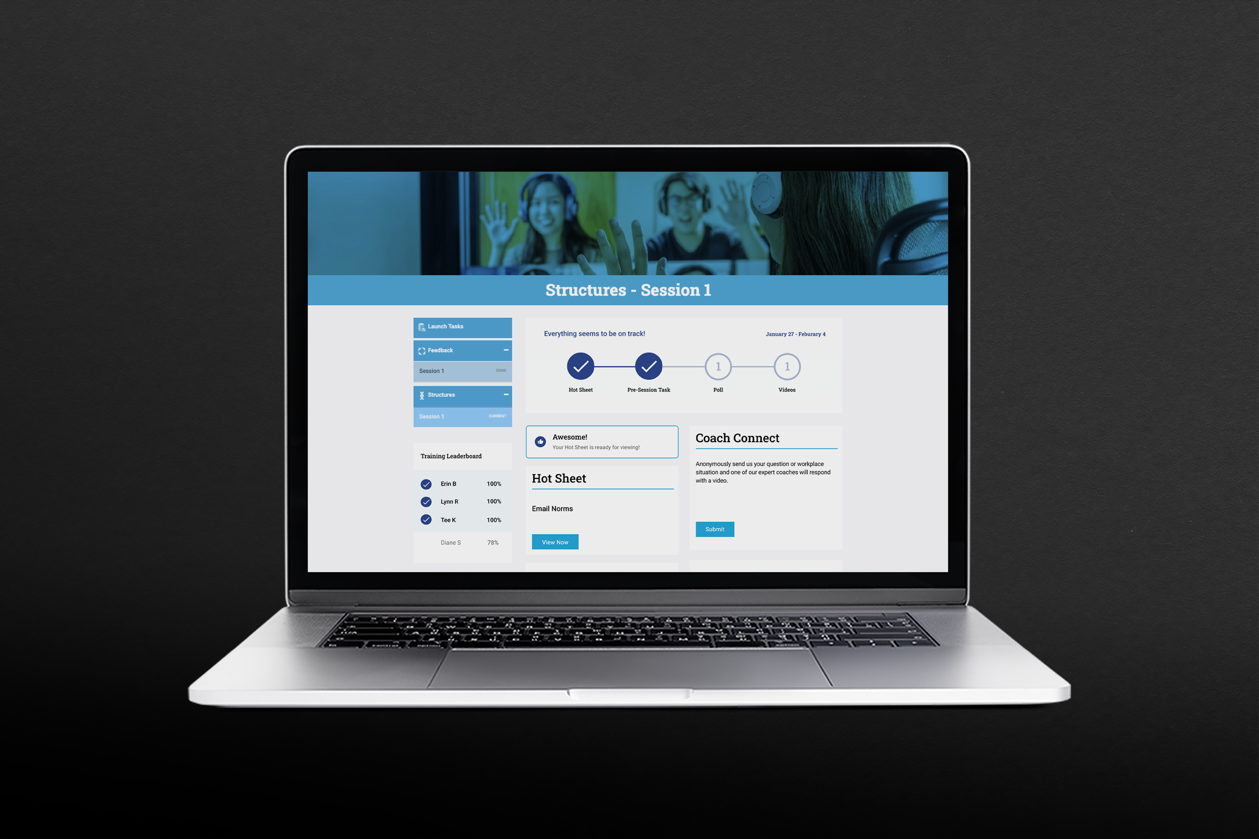
Track Progress
Give Participants more control (Poll-Redesign)
Training Leaderboard
Phase 2
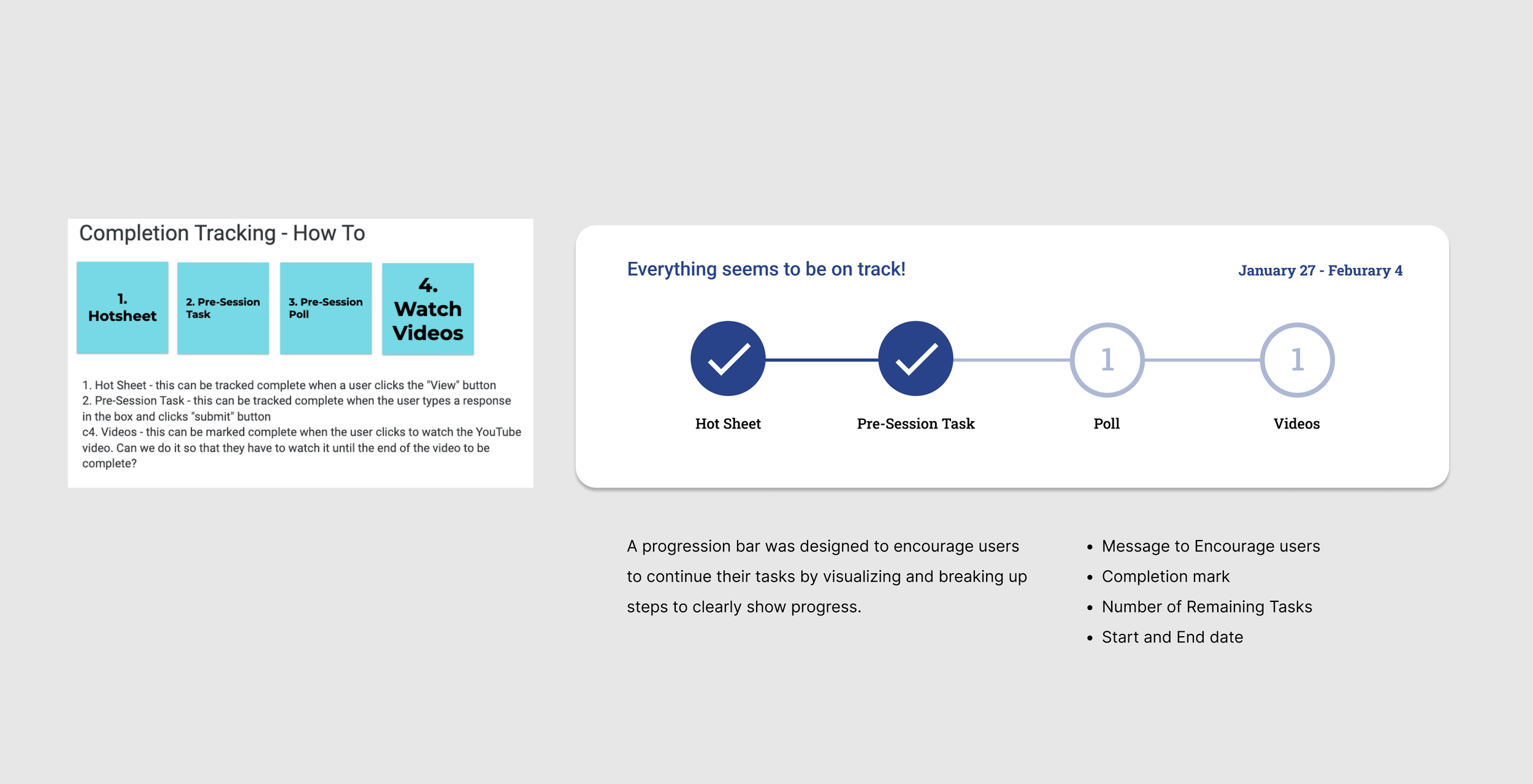
Task 1/3 - Visualizing Completion Tracking
Task 2/3 - Re-designing the Poll
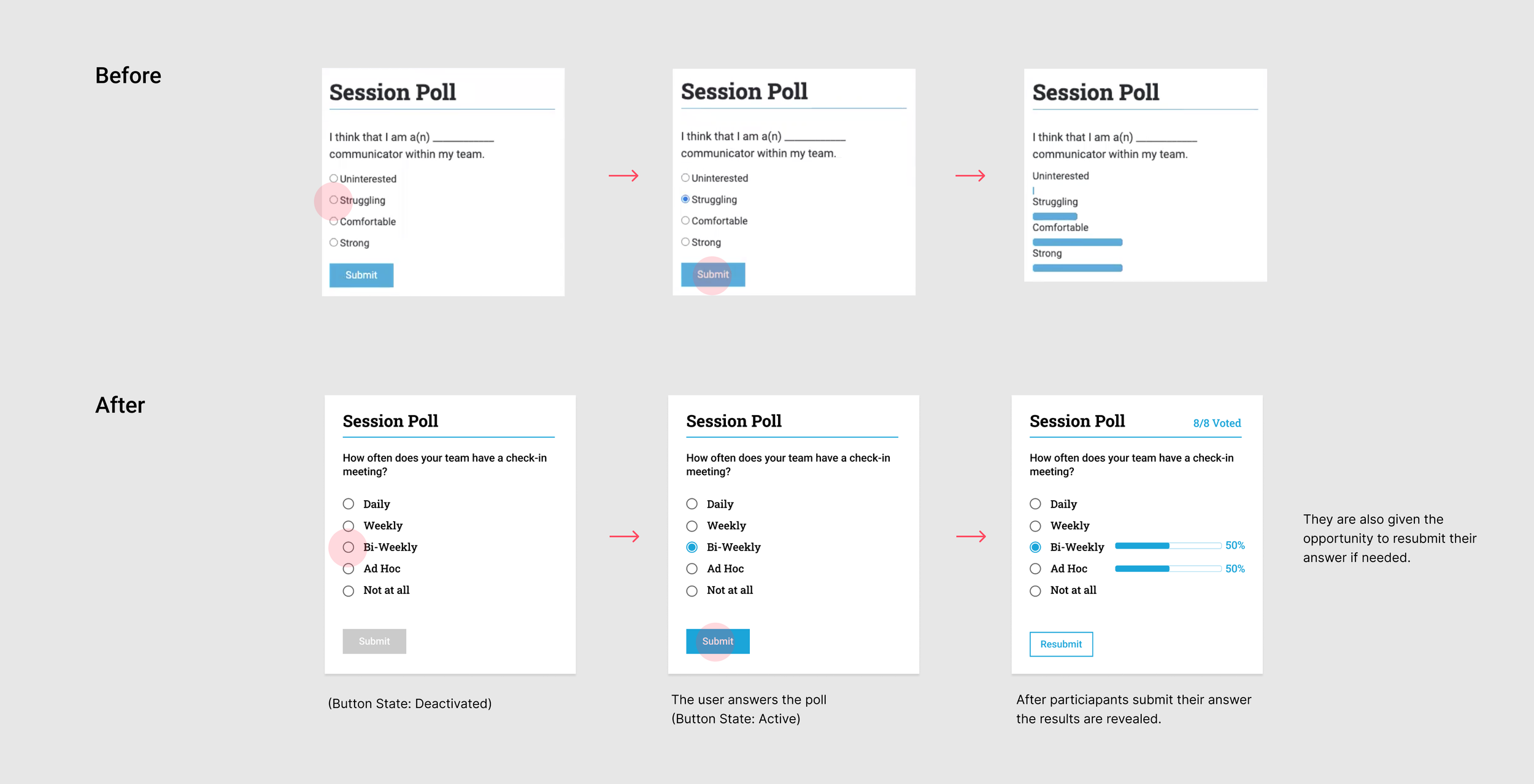
The poll was improved by making simple changes to guide users through the process. We focused on giving participants more control over their actions and environment through the changes shown below
Task - 3/3 - Adding a Training Leaderboard
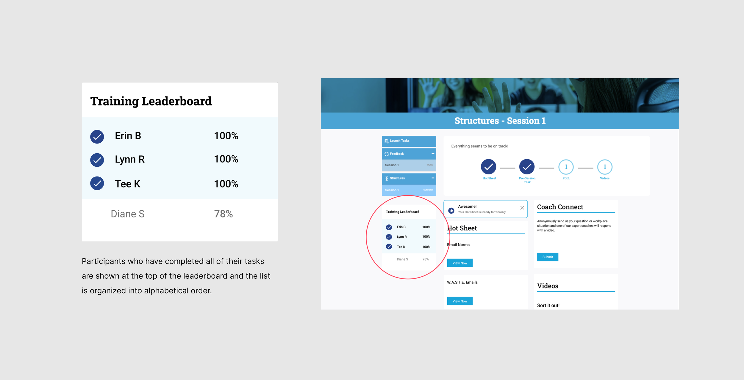
To motivate the users to finish their tasks, we designed the leaderboard. Participants can see in percentages how far they and others are with their tasks. Once a participant fully completes their tasks, they are moved to the top of the board with a completion tag (organized in alphabetical order).
Next Steps & Takeaways
The Next steps
will be to make any final updates to launch phase two and analyze user data on the page while we continue to build out phase 3 and see where we can improve.
My Takeaway
I had the chance to work cross-functionally with exceptionally talented fellow development, marketing, and design team. I got an in-depth walk of the backend, which expanded my knowledge of how the platform works.
During Phases one and two of this project, I was also working on other projects (website, team assessment page and creating the design system). I learned to adjust, and work around time, constraints, company needs, and the client's wants.