
WINGS
Timeline: June 2022 - December 2022
Design by Diane Shin: Sole UXUI Designer
Design to reduce the stress of flight attendants and help handle work more efficiently during flights and improve the quality of passenger service.
Designing for Flight Attendants
flight attendants feel a sense of responsibility for their duties in a restricted environment during flights, and they must cope with schedule variability and unforeseen situations. Despite being in inherently stressful situations, they always strive to provide friendly and reassuring service. WINGS was designed to enable them to offer a service that is always kind and reassuring, even in potentially stressful circumstances.
ADHERING TO USER NEEDS
Solution Considering Contextual Factors
Analyze the context in which the device will be used. Consider factors such as the user's physical environment, location, time constraints, and social settings. This analysis helps determine the device's form factor, portability, and interaction requirements.
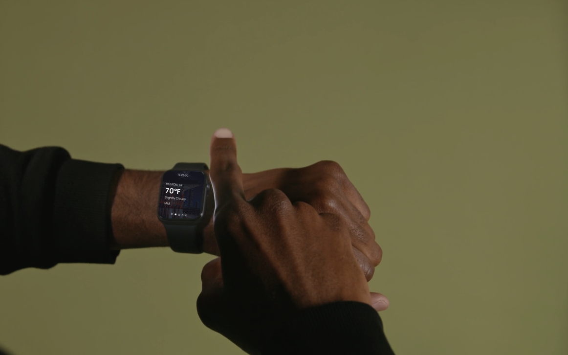
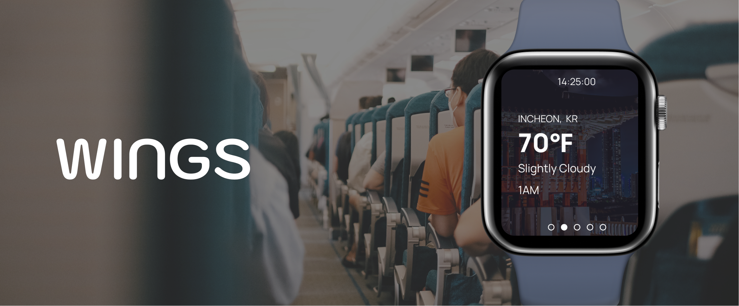
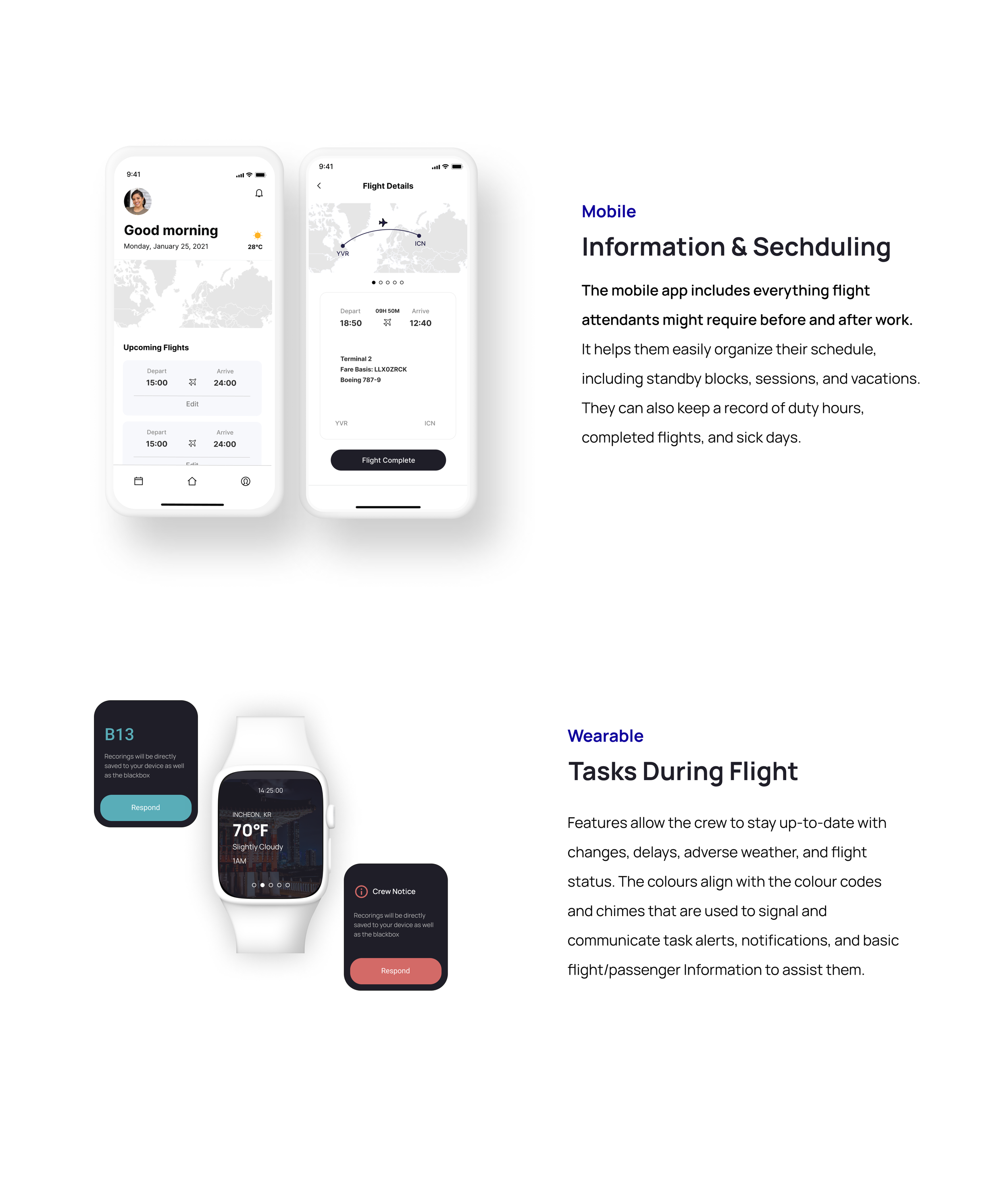
SmartWatch App During Flight
It is designed with a focus on features that enable attendants to quickly grasp necessary information and handle tasks more efficiently. Only essential information is displayed to allow attendants to check and manage their work without any unnecessary distractions.
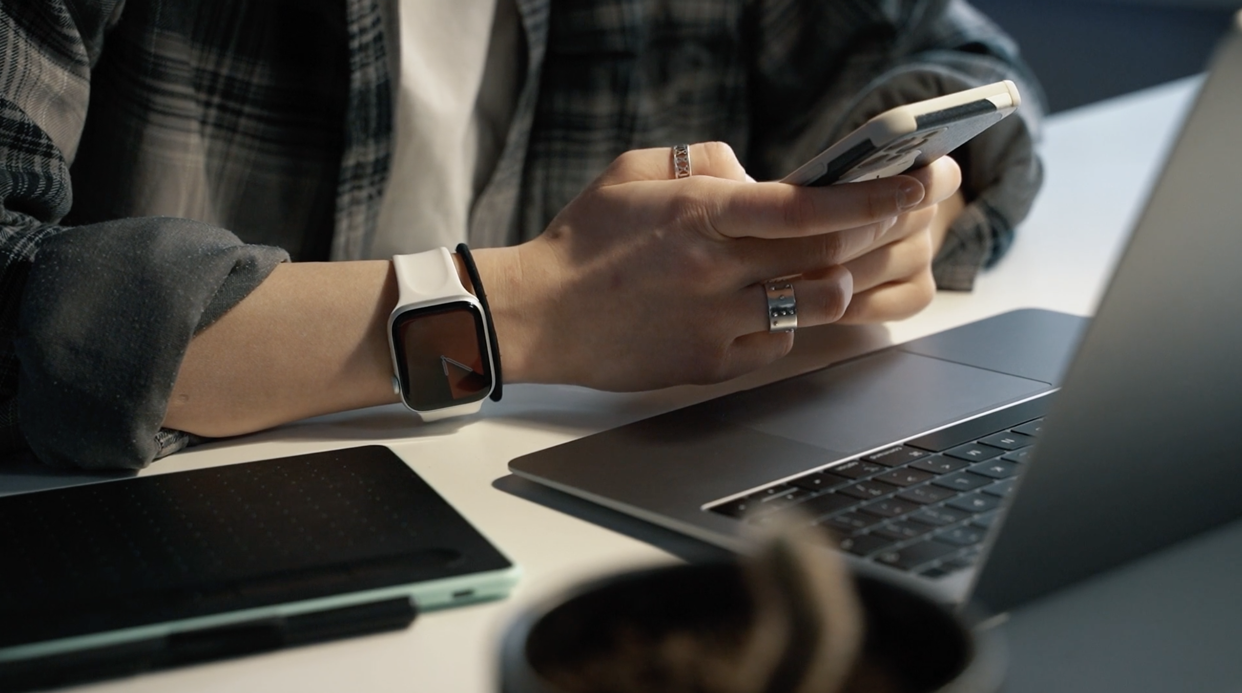
Mobile App Before & After Flights
Users can check their schedule prior to work and can create and manage their work logs through the app.
Necessary information from the watch is transferred to the mobile app after flights resulting in increased work efficiency.
Research + Design Process
USER RESEARCH
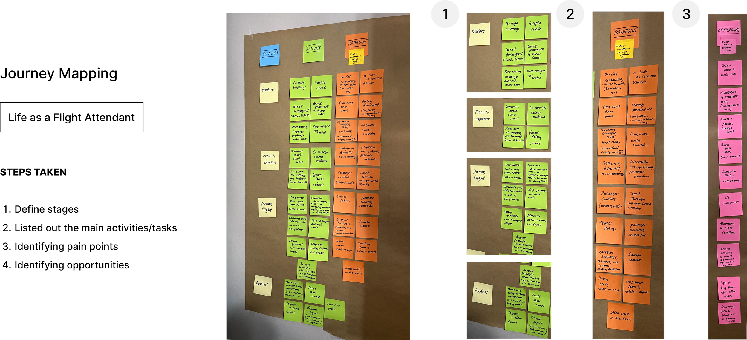
IMAGINING THE EXPERIENCE
CONSISTENT IN-FLIGHT COMMUNICATION
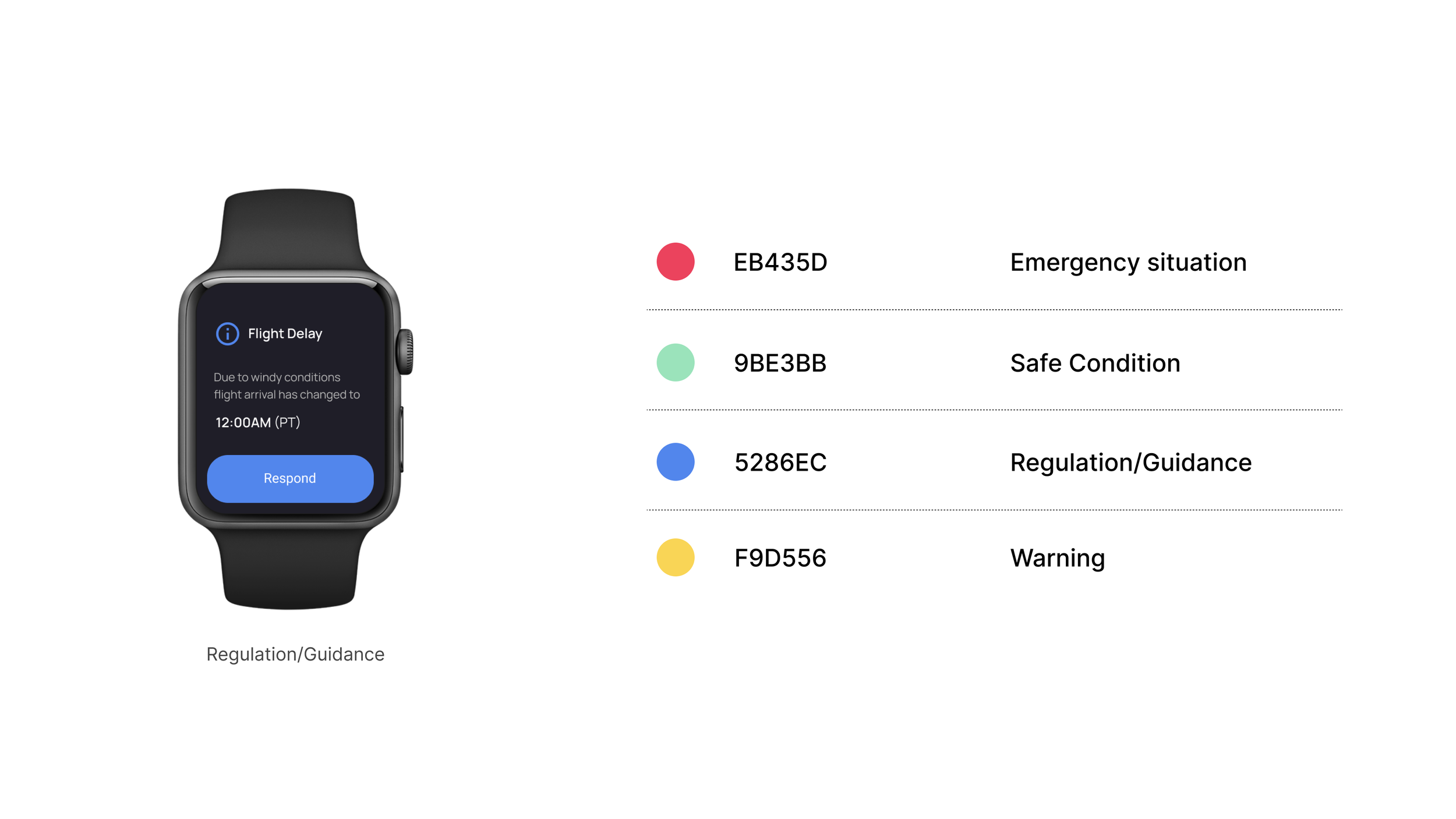
Using Colors and Patterns Currently Used in an Aircraft
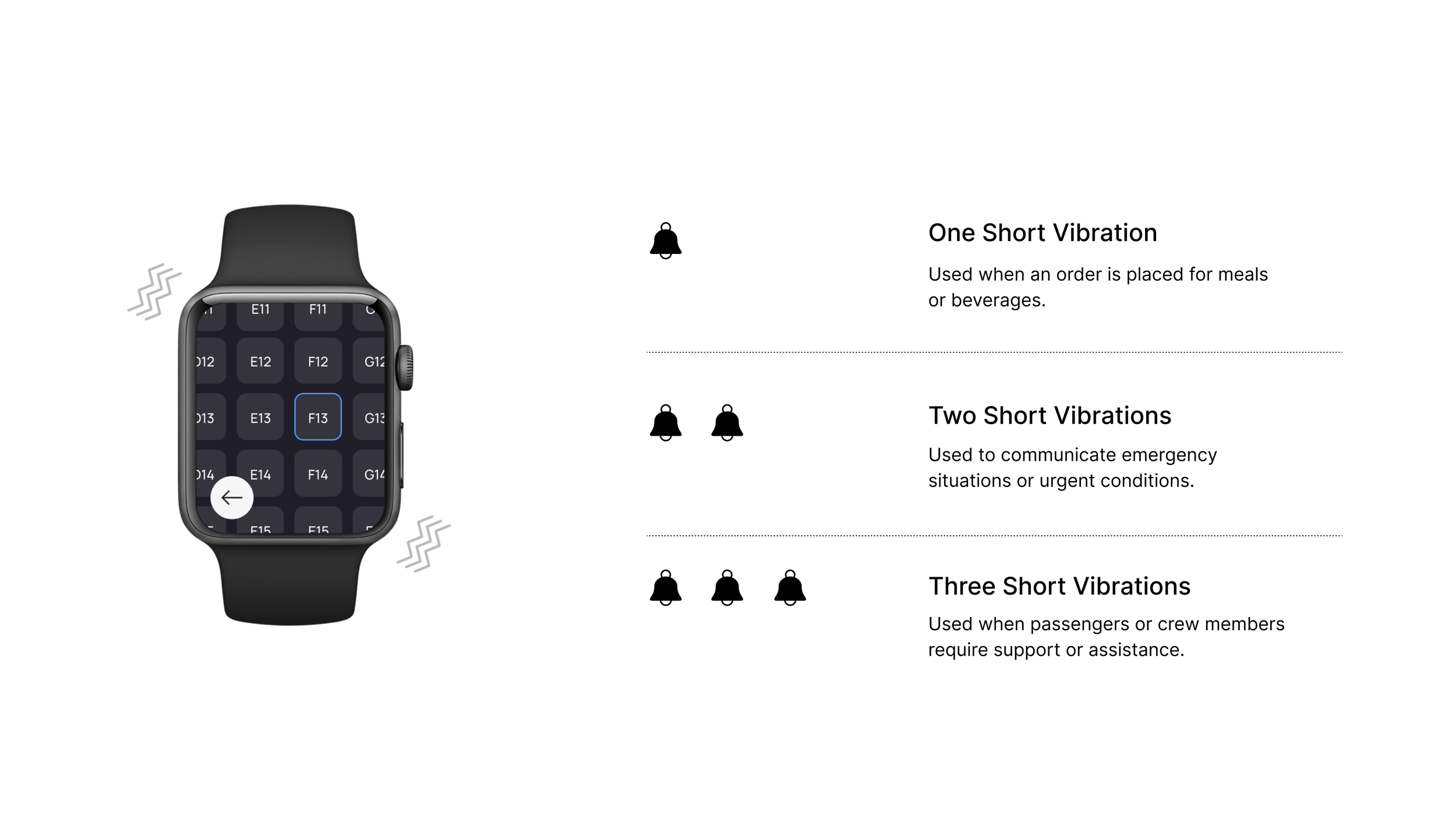
In aircraft, there is often an association between bells and colors. For example, in bell patterns used during flights, colors are sometimes used in conjunction. In such cases, when a bell is rung, specific colored lights may illuminate, making it easier for passengers or crew members to recognize the corresponding bell pattern being requested.
1. Simple UI Color Specifications: By using familiar colors set for each situation, users can easily recognize information and reduce the potential for errors or mistakes that may occur during tasks.
2. Bell Patterns and Micro Interactions: In environments where flight attendants cannot hear or where noise is very loud, they can perceive the bell by the vibration from their watch.
FINAL DESIGN
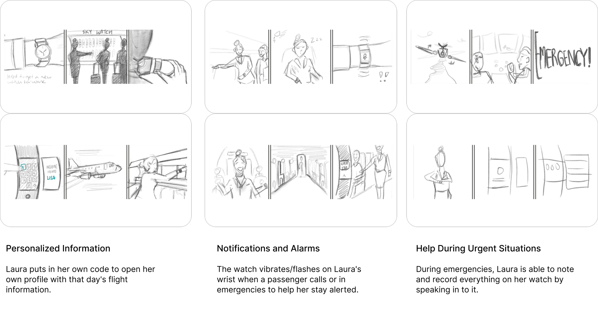
Main Features
Introducing an innovative app that goes above and beyond for the well-being of flight crews, seamless communication, and stress-free experiences for everyone onboard. The carefully crafted features are tailored to optimize communication even in low bandwidth situations on flight, while also alleviating workload and delivering convenient services on and off-board. By displaying only necessary details, attendants can effortlessly manage their work without unnecessary distractions.
Takeaway + Conclusion
In conclusion, I wanted to design an experience a new era of air travel where mental well-being and efficiency take flight together. Experience a new level of efficiency and focus with our app, designed to elevate the in-flight experience for flight crews and passengers alike.