
WINGS
Timeline: June 2021 - July 2021 (2 Weeks)
Design by Diane Shin: Sole UXUI Designer
About Wings: Designed to reduce the stress of flight attendants and help handle work more efficiently during flights to improve the quality of passenger service.
Background
This project was a valuable academic exercise that introduced me to quick design solutions while focusing on user constraints. The challenge of the exercise was “Designing for a Low Bandwidth Area”. Despite its brevity, the project laid the foundation for my design journey, emphasizing the significance of context and constraints in producing innovative solutions.
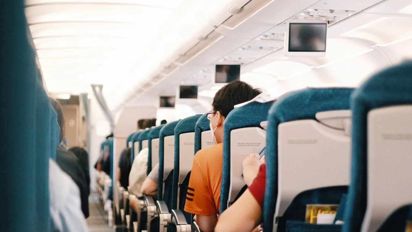
Designing for Flight Attendants
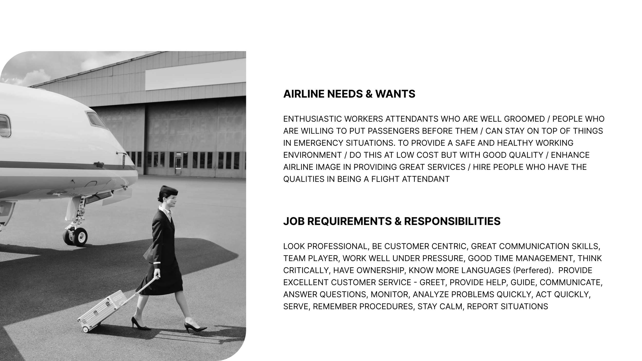
Flight attendants feel a high responsibility for their duties during flights, and they must cope with schedule variability and unforeseen situations in a restricted environment. Despite being in inherently stressful situations, they are always required to provide friendly and reassuring services. WINGS is a project that allows flight attendants to work to their full potential by providing a healthier working environment through its solutions.
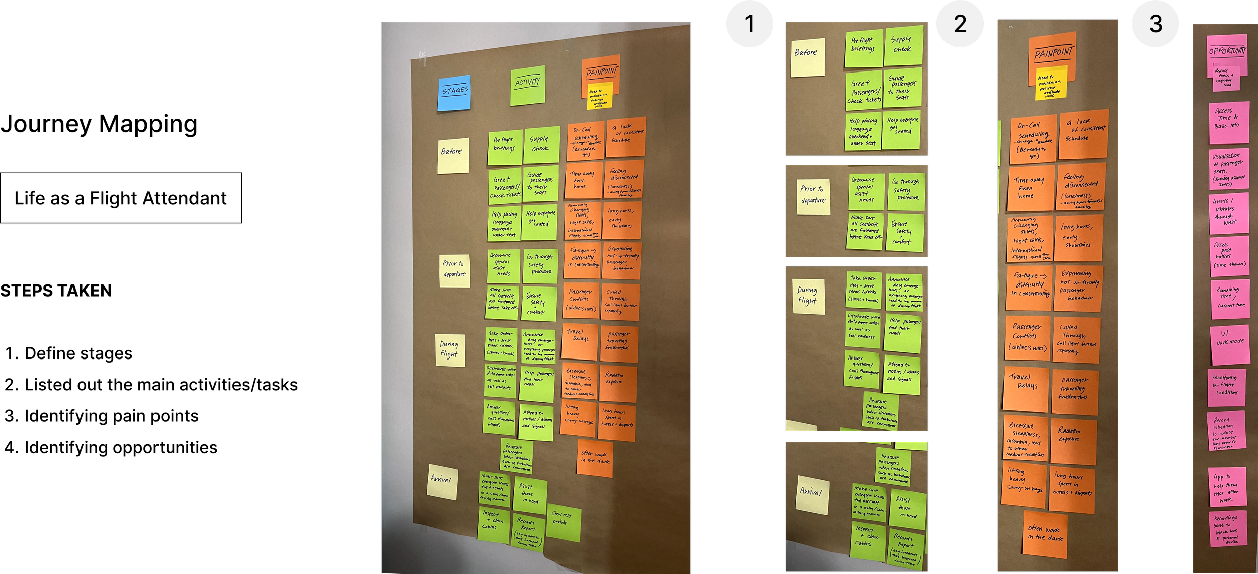
Research Process
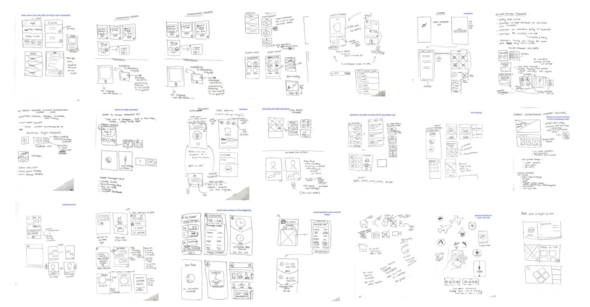
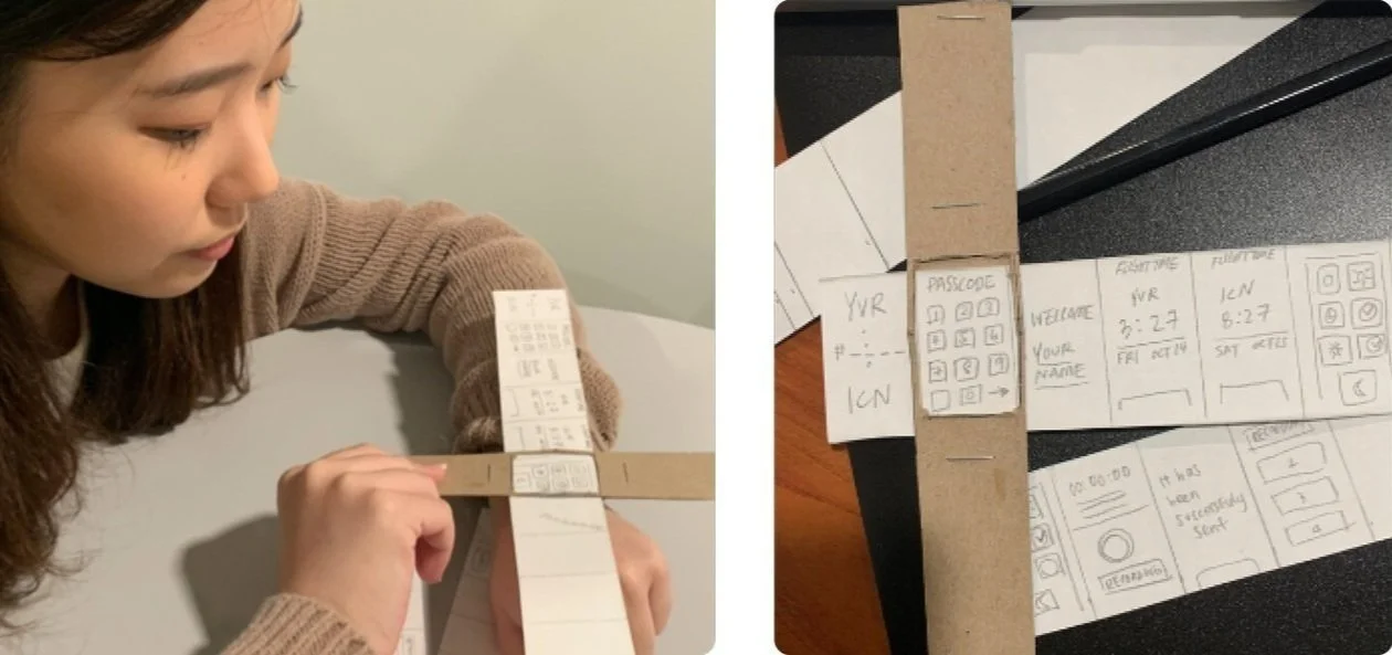
I first analyzed the context and constraints in which the device will be used to consider factors such as the user's physical environment, location, time constraints, and social settings. This analysis helped me determine the device's form factor, portability, and interaction requirements while focusing on what the user really needs.
Imagining the Experience
Design Process
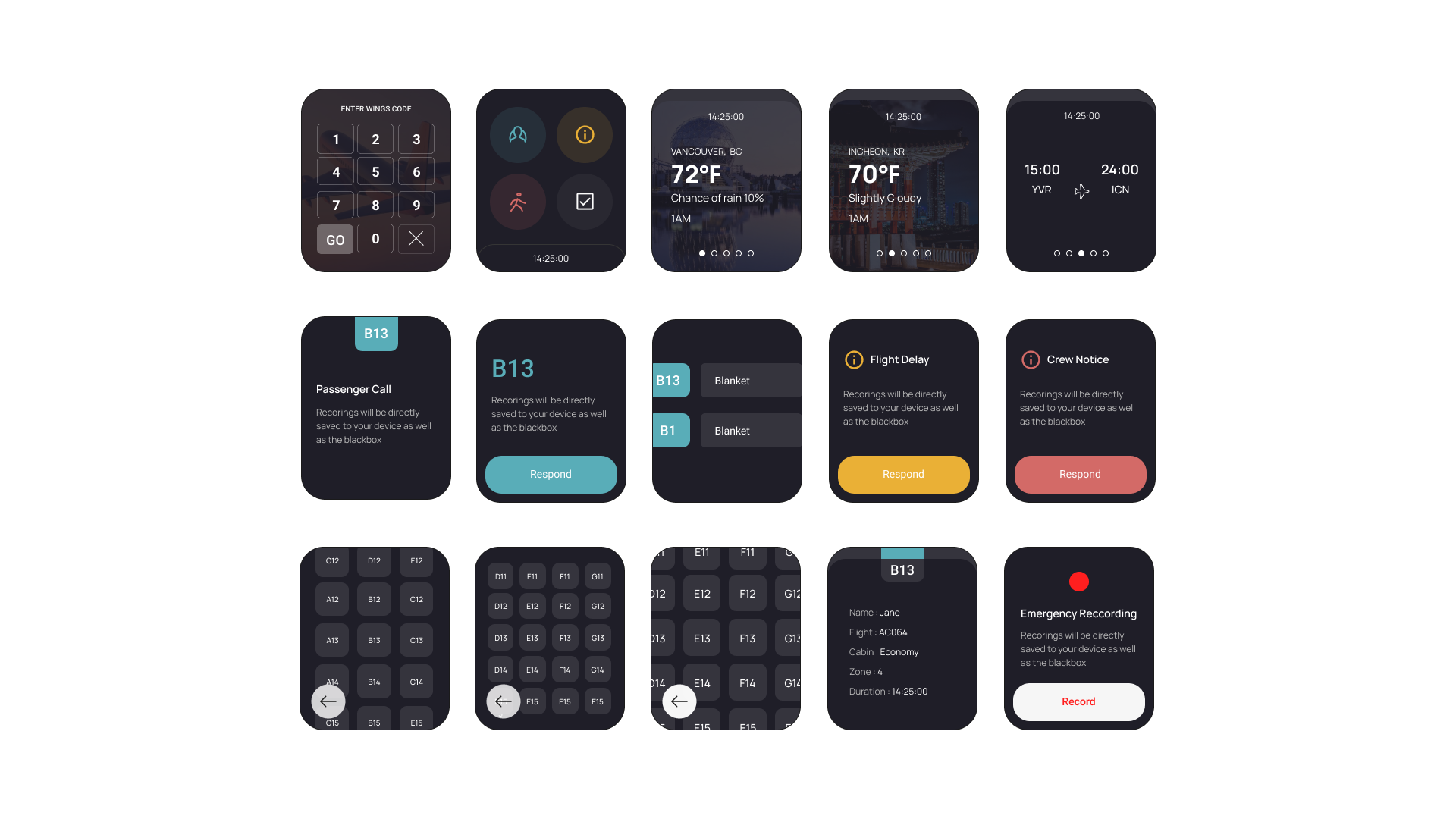
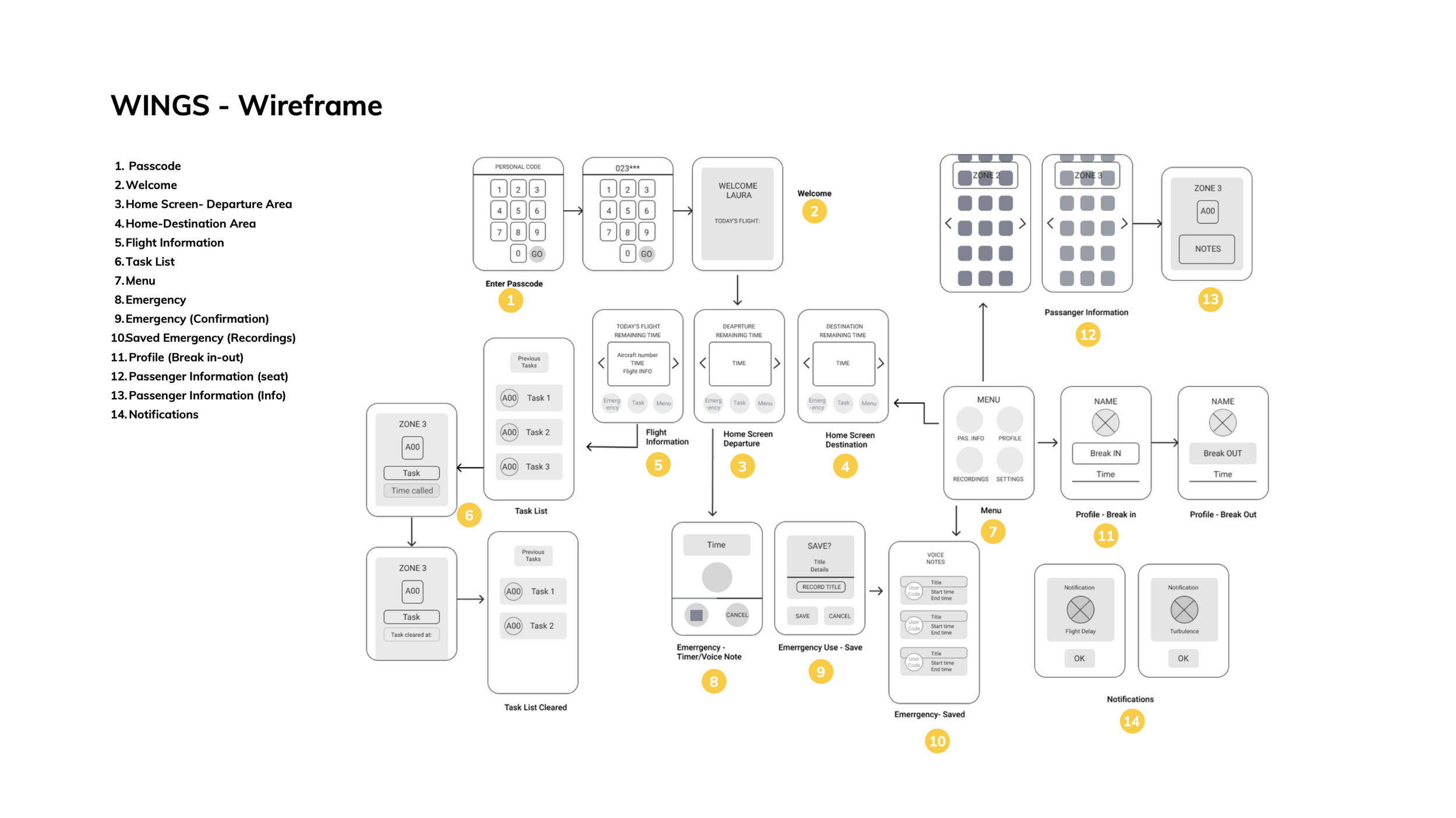
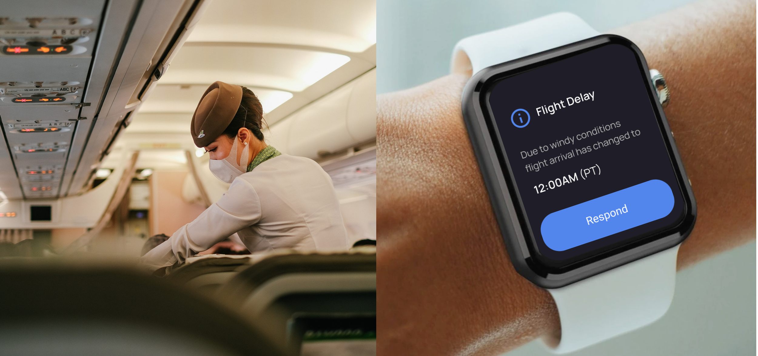
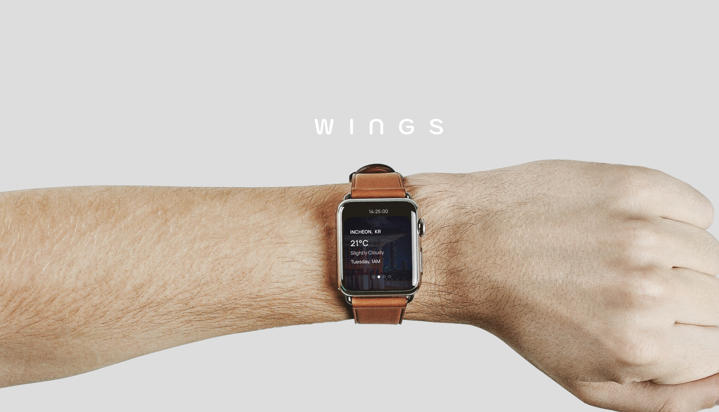
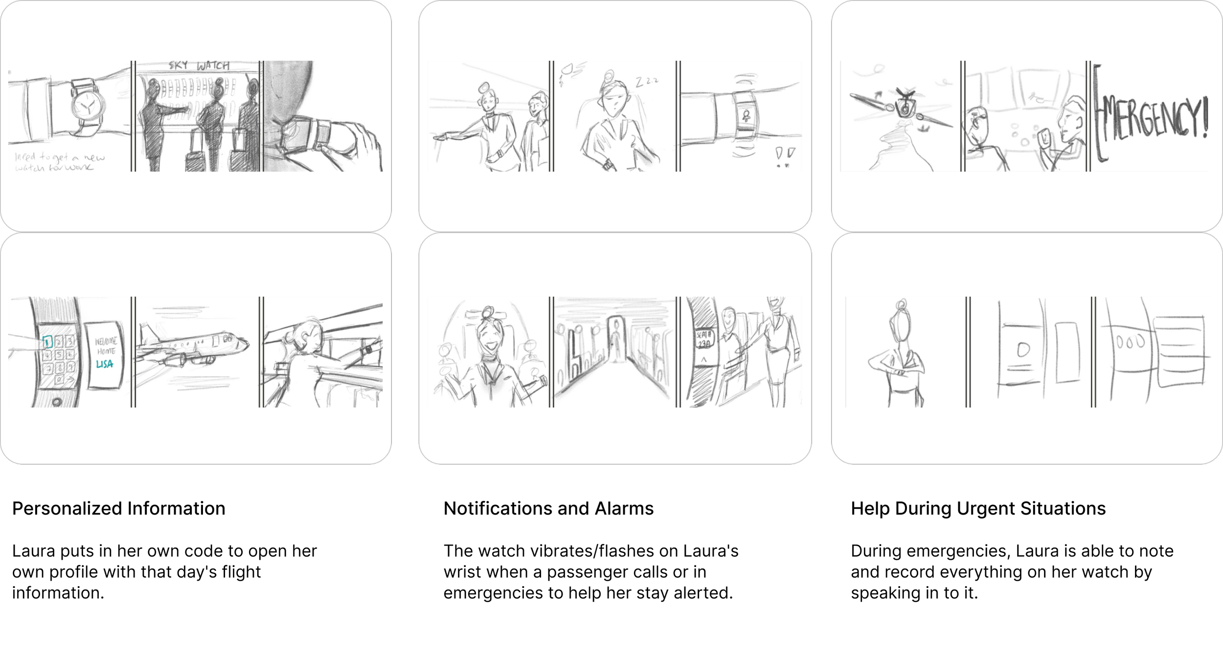
Design: Consistent Inflight Communication
It is designed with a focus on features that enable attendants to quickly grasp necessary information and handle tasks more efficiently. Only essential information is displayed to allow attendants to check and manage their work without any unnecessary distractions.
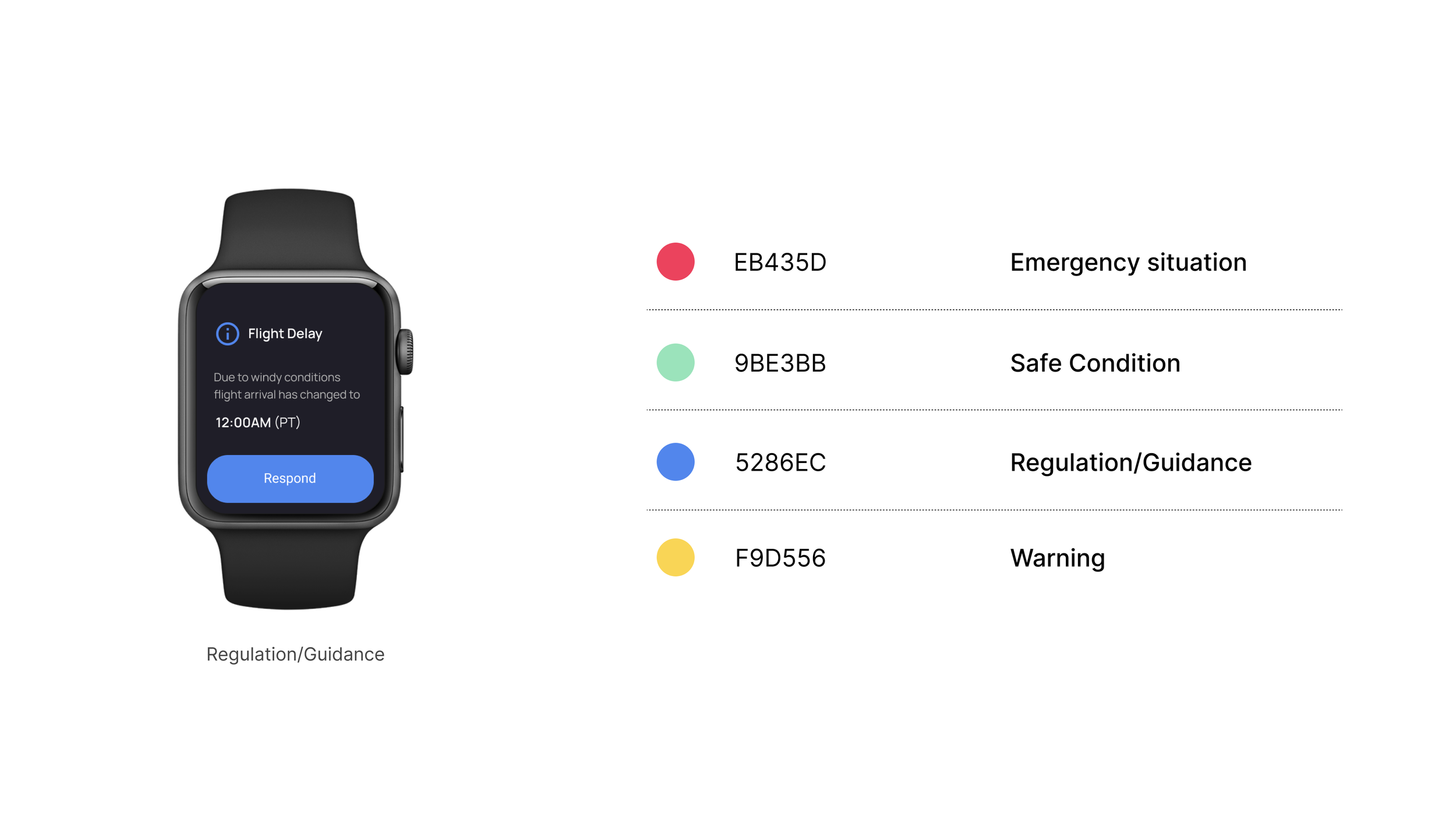
Solution # 1: Referring to Colors and Patterns Used in the Aircraft
In aircraft, there is often an association between bells and colors. For example, in bell patterns used during flights, colors are sometimes used in conjunction. In such cases, when a bell is rung, specific colored lights may illuminate, making it easier for passengers or crew members to recognize the corresponding bell pattern being requested. I have incorporated this system into the design to reduce the learning curve of having to re-learn a new system.
1. Simple UI Color Specifications: By using familiar colors set for each situation, users can easily recognize information and reduce the potential for errors or mistakes that may occur during tasks.
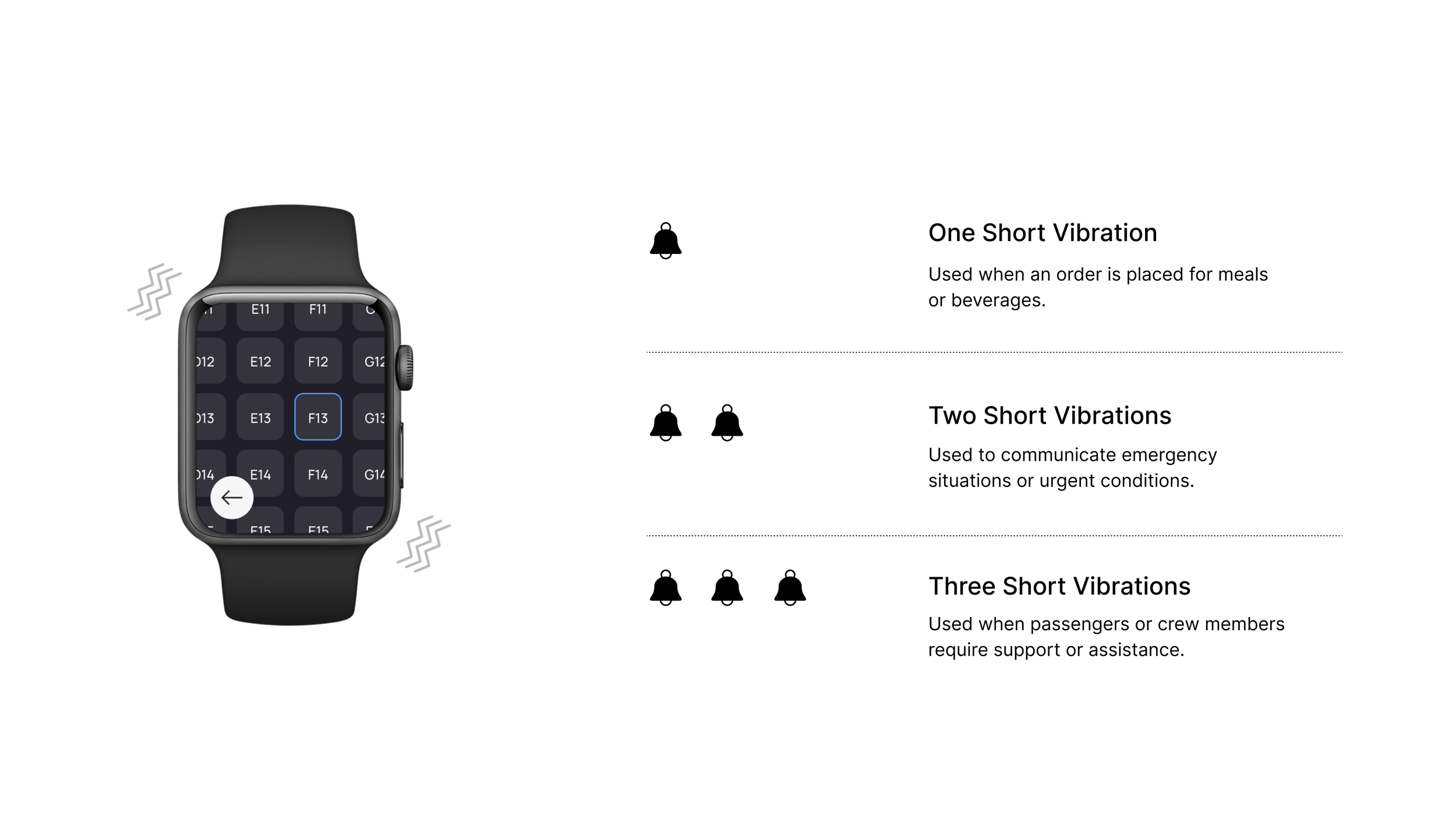
Solution #2: Bell Patterns and Micro Interactions:
In environments where flight attendants cannot hear or where noise is very loud, they can perceive the bell by the vibration from their watch.
In the future, with more time, I want to continue to expand and further explore design elements, and layouts, along with the mobile app so I can continue to develop + update the experience to represent my core ideas based on new/current flight situations.
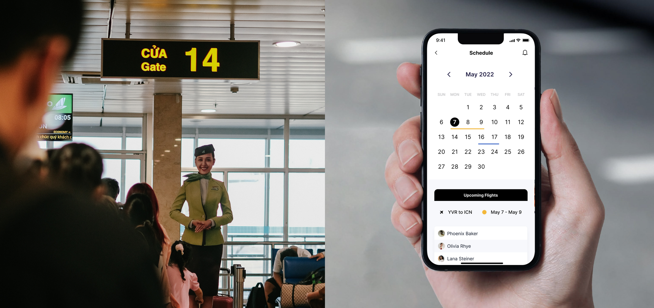
Next Steps: Mobile App Before & After Flights
While working on the exercise I imagined a mobile app being a part of the full solution. Users should be able to have the necessary information from the watch transferred over to the mobile app after flights resulting in increased work efficiency, along with the ability to check their schedule and manage work logs through the app.
Takeaway
I had to explore and generate creative ideas to address the challenges of limited connectivity.
It taught me the importance of understanding user needs, conducting thorough research, and quickly iterating on design concepts.
I found immense satisfaction in pushing the boundaries of what was possible within the project's scope and applying my unique design thinking to create innovative solutions.
It served as a reminder of the power of design to solve real-world problems and make a positive impact.