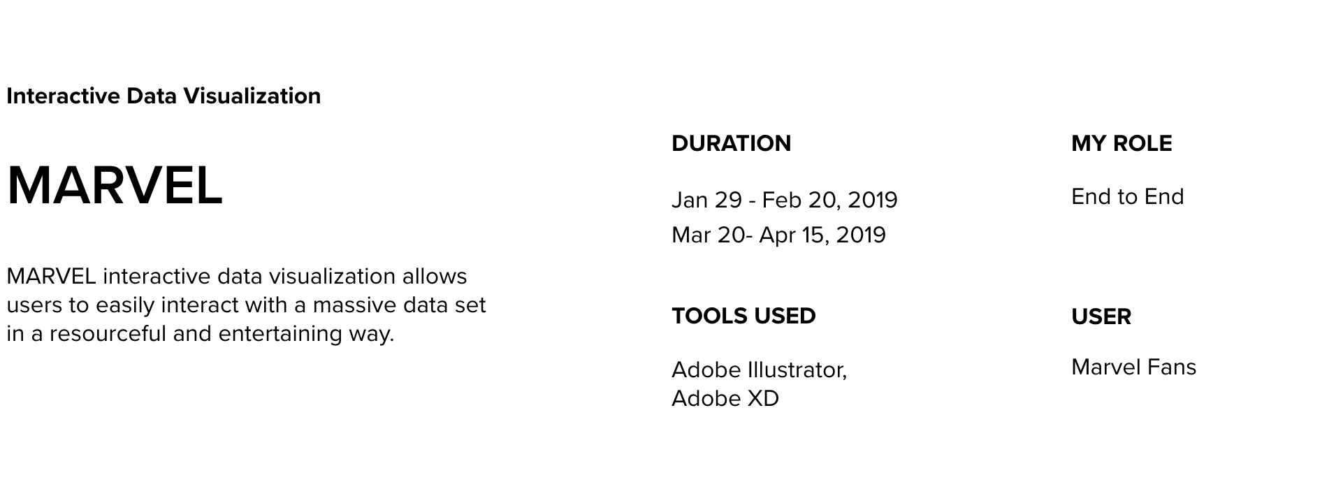
Design comes to completion with constant development. This Interactive data was one of my first projects as an Interaction Design student.
A year later, I decided to re-approach it by designing with the user group in mind.
First Attempt

Thought Process
(User Journey) Before - Based off of assumptions
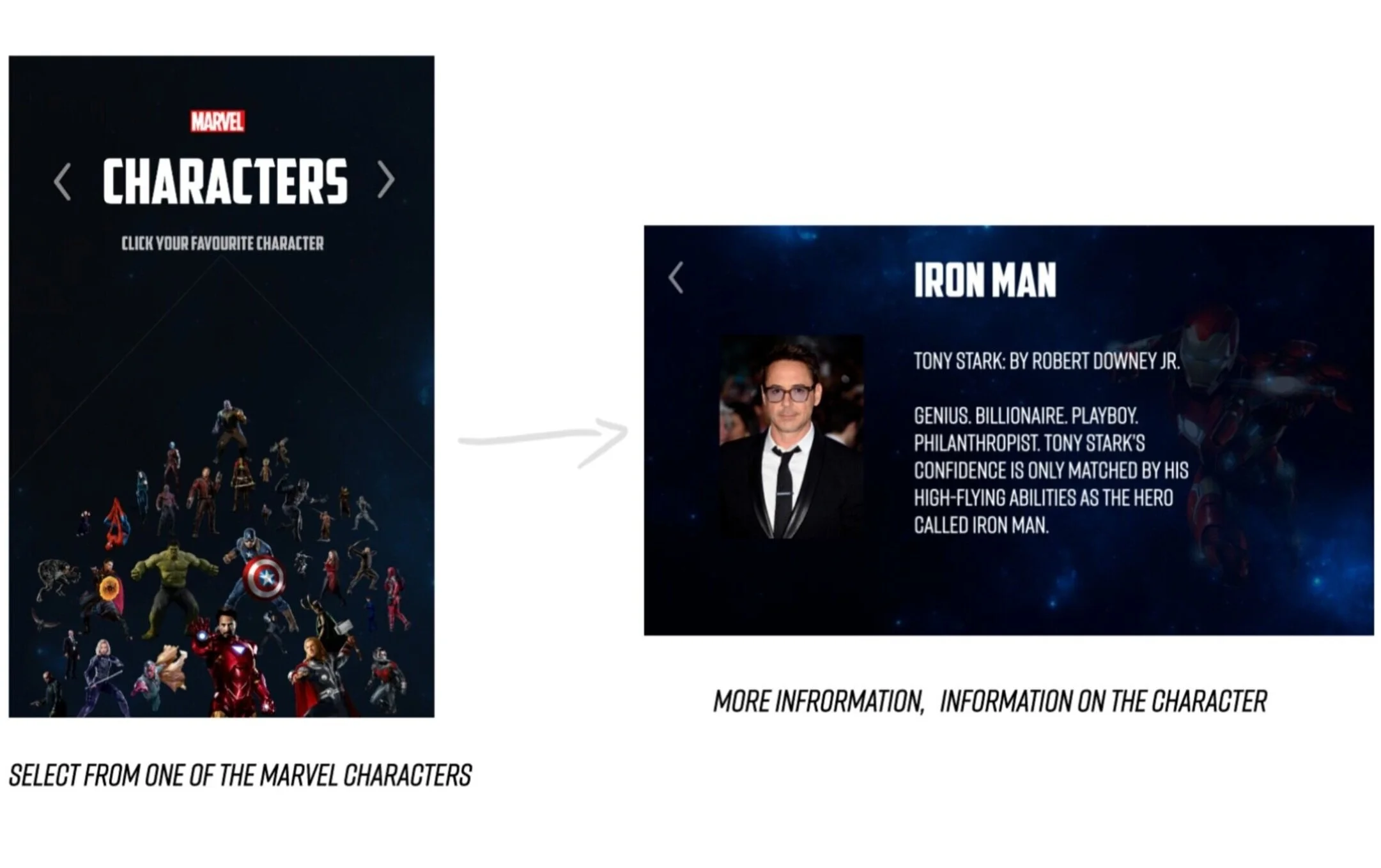
Loves Marvel movies
Wants to know more in depth about their favourite character and which movies they are be found in.
Searches for information.
Finds the data source and looks through it.
Finds a movie they want to check out.
Starts enjoying marvel movies.
There are a lot of Marvel movies. It’s hard to follow along if you don’t watch it in order, so many heroes, people tell you “you need to watch the one before to understand”
Who has time for 46hours 48 minutes of Marvel before watching the new Avengers movie?
Collecting Data - Notes
I tried to find a reliable data source to use. I spent a lot of time distinguishing and understanding the distinction between a good and bad data until I was able to recognize the difference.
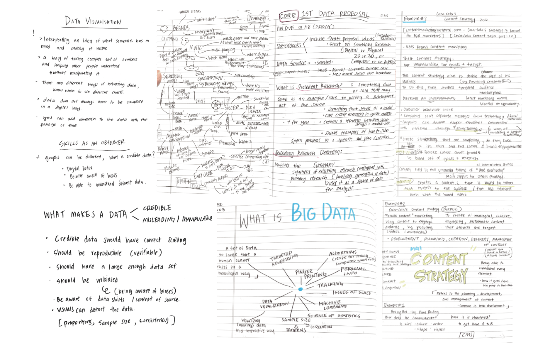
Used Sources
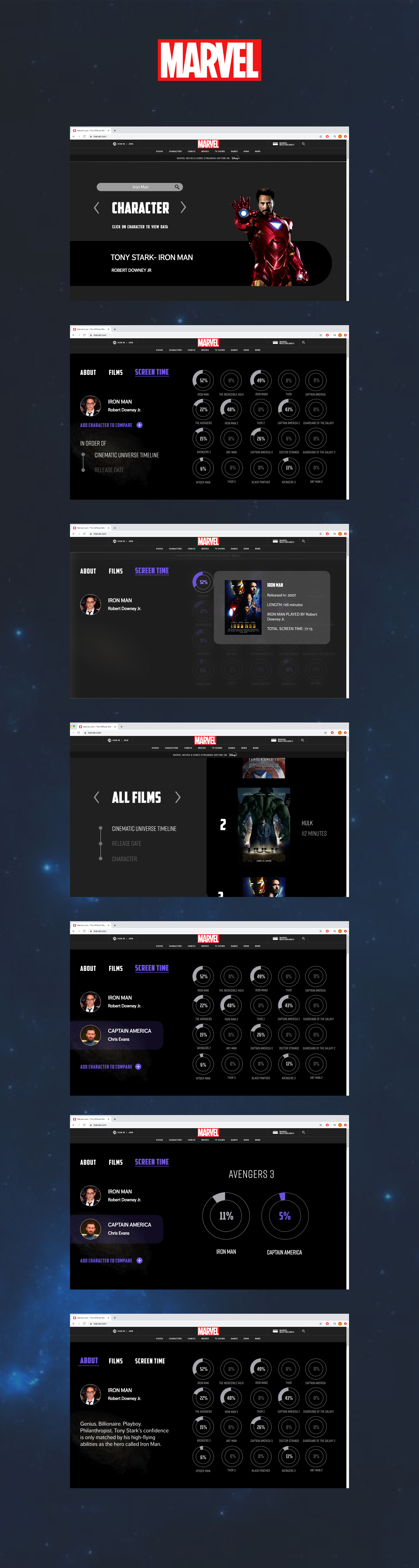
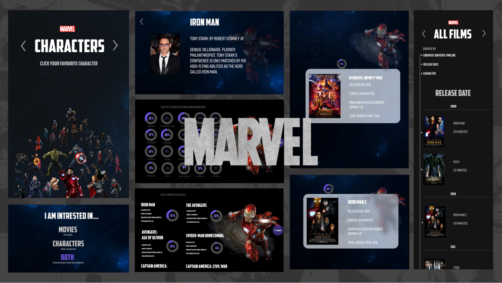
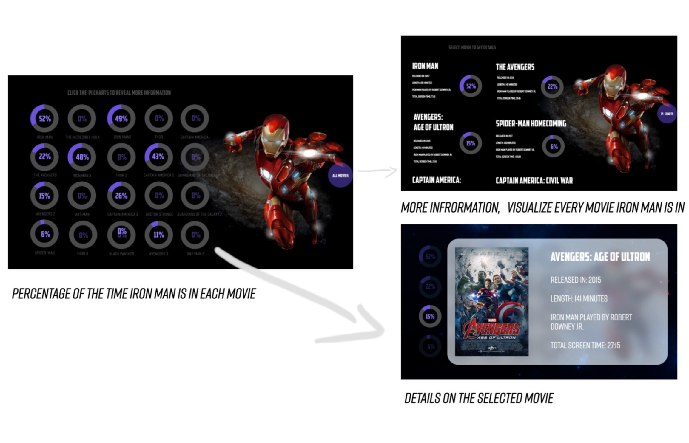
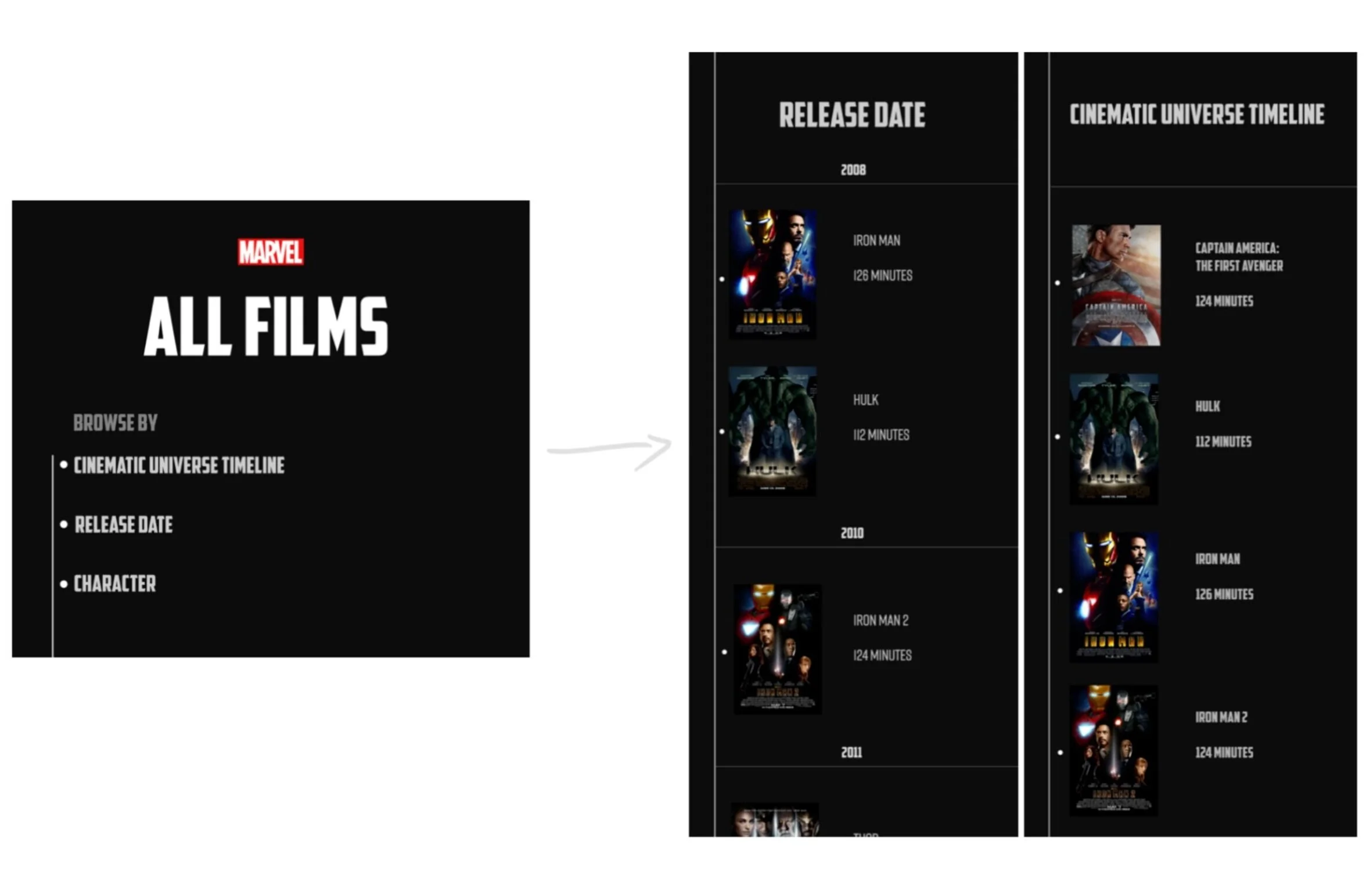
Marvel has a large data set on their films and characters and with so much information online, My challenge was to pick the right data set to visualize. I Used the Marvel’s site for information about the character, and IMDb’s data of screen time for each character, then converted it in to percentage to create charts using infogram.

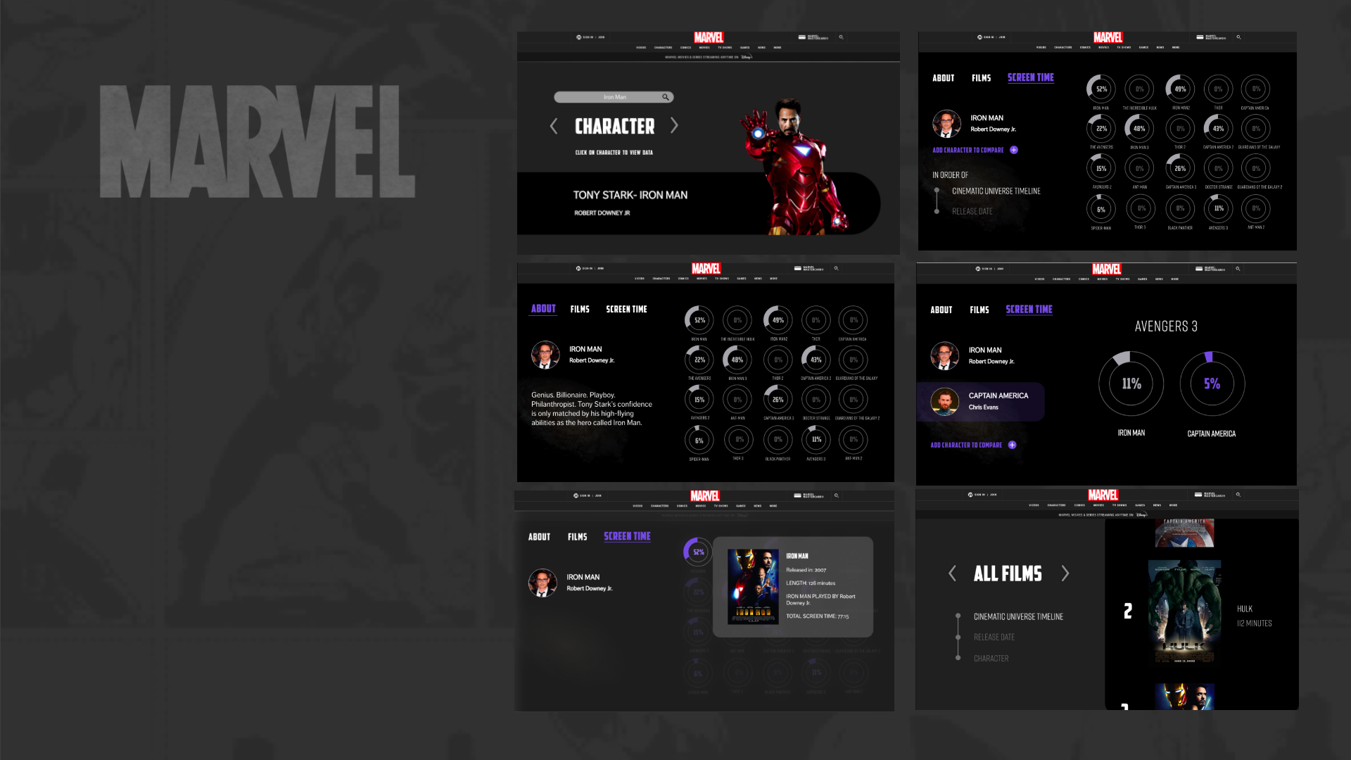
Re-Designed

“Would the users would actually have fun viewing just the screen times of the characters?”
Thought Process
After - User Journey
hears it’s a good movie.
watches it (doesn’t understand fully)
feels like they are missing out and becomes curious.
looks it up online.
discovers this data source that helps them understand the marvel cinematic universe and is surprised at how Captain America is on screen less than Iron Man in his own movie.
starts enjoying marvel movies.
When first designed, I focused hugely on finding the right data set, so I wanted focus on the users this time, to deliver a user friendly interaction.