
MEDUCE
A mobile application designed to help immigrants in Canada overcome language barriers to better understand medication usage and improve treatment.
Meduce received an honourable mention in the 2021 Emily Carr University Grad Show, increased my passion for research.
Target Users: Immigrants of Canada
My Role: Sole UX/UI Designer
Timeline: September 2020 - February 2021
Problem
Project Goal
Canada has a large immigrant population who face challenges related to English proficiency, especially during the pandemic restrictions made it difficult for many individuals to communicate their medical needs effectively the importance and necessity of a new experience in addressing these communication barriers.
To allow individuals who take multiple medications or have limited health literacy or language proficiency to easily manage their medications.
User Group
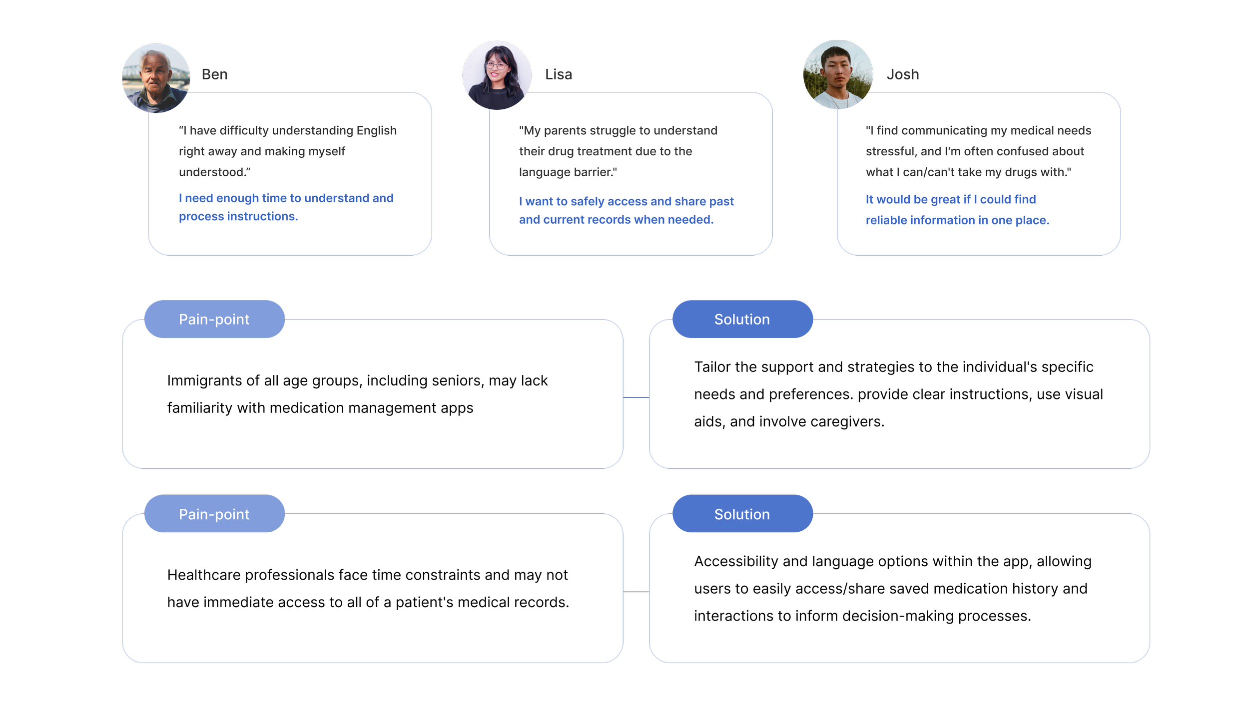
Based on user insights, I established four goals to drive the development process. These goals consider a diverse user base, including children of immigrants, immigrants of all ages, healthcare professionals, and individuals interested in actively participating in their medication-taking process.
As of 2021, the immigrant population accounted for approximately 8.9 million people, making up around 23.7% of the total population.
Research
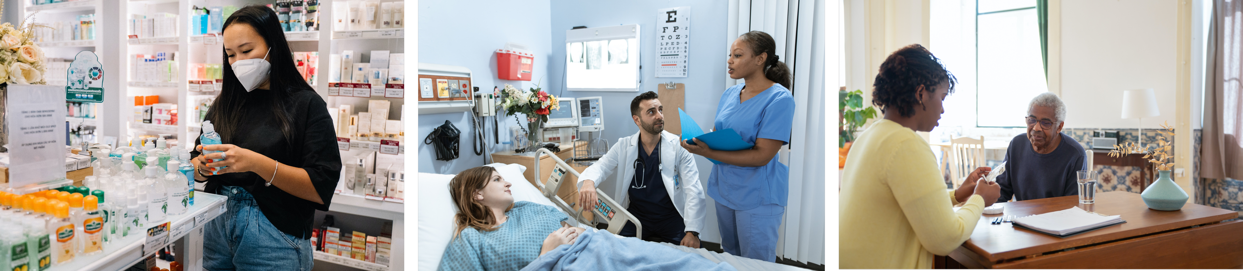
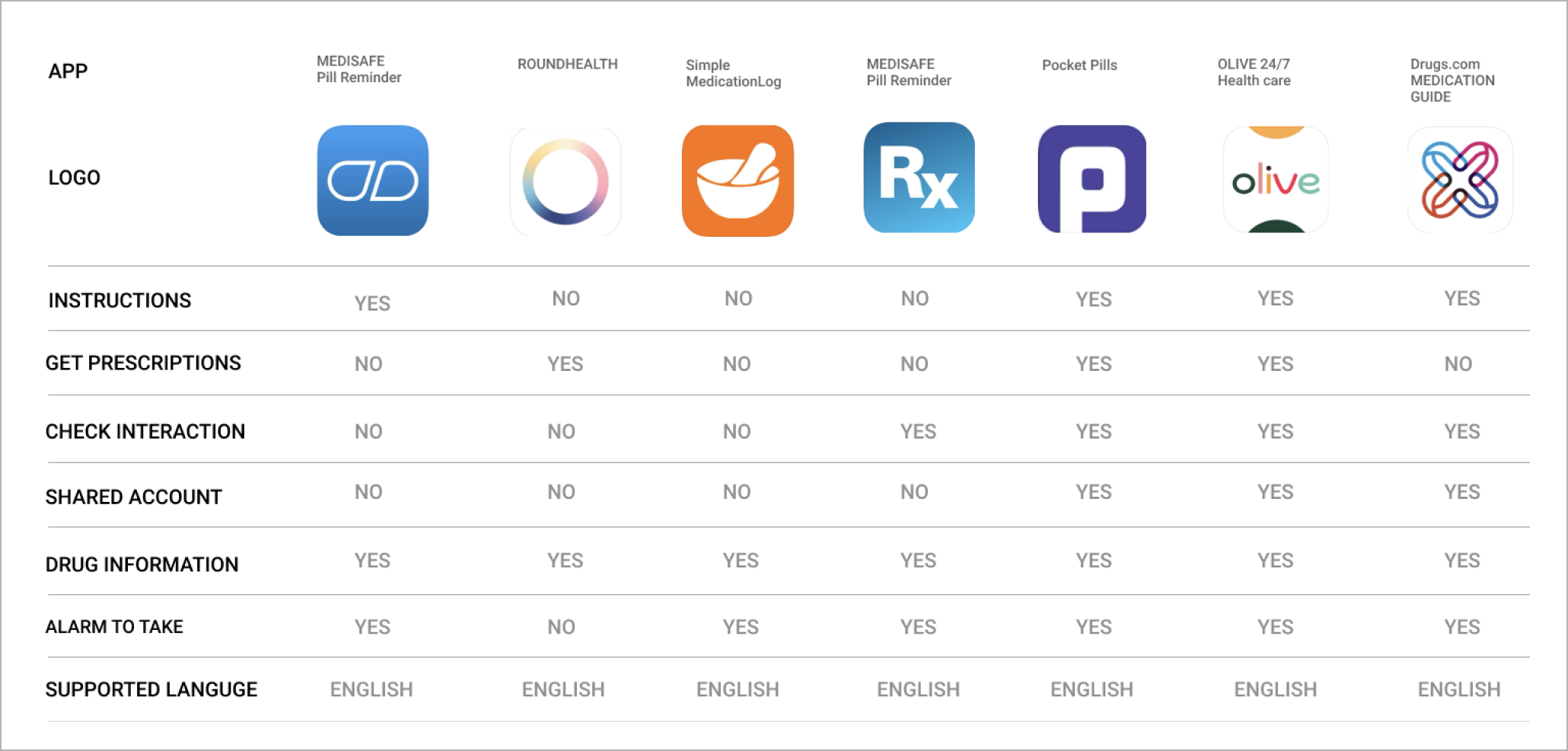
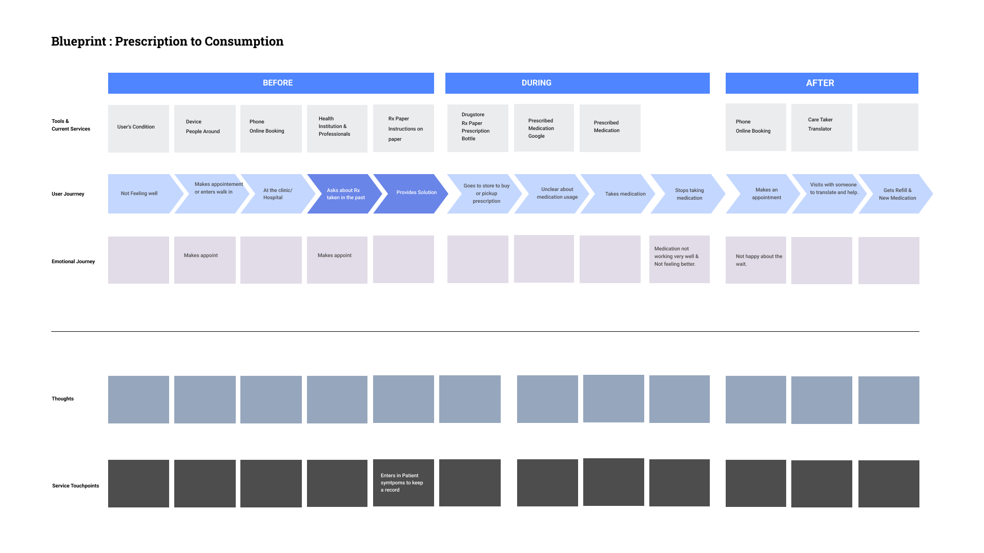
Generative Research: Field Research, Interviews, Online Surveys. Apps that were being used mainly focused on features such as pill tracking, reminders, refills or directly connecting users to healthcare professionals. These solutions did not fully address the needs of our specific user group (immigrants with language barriers).
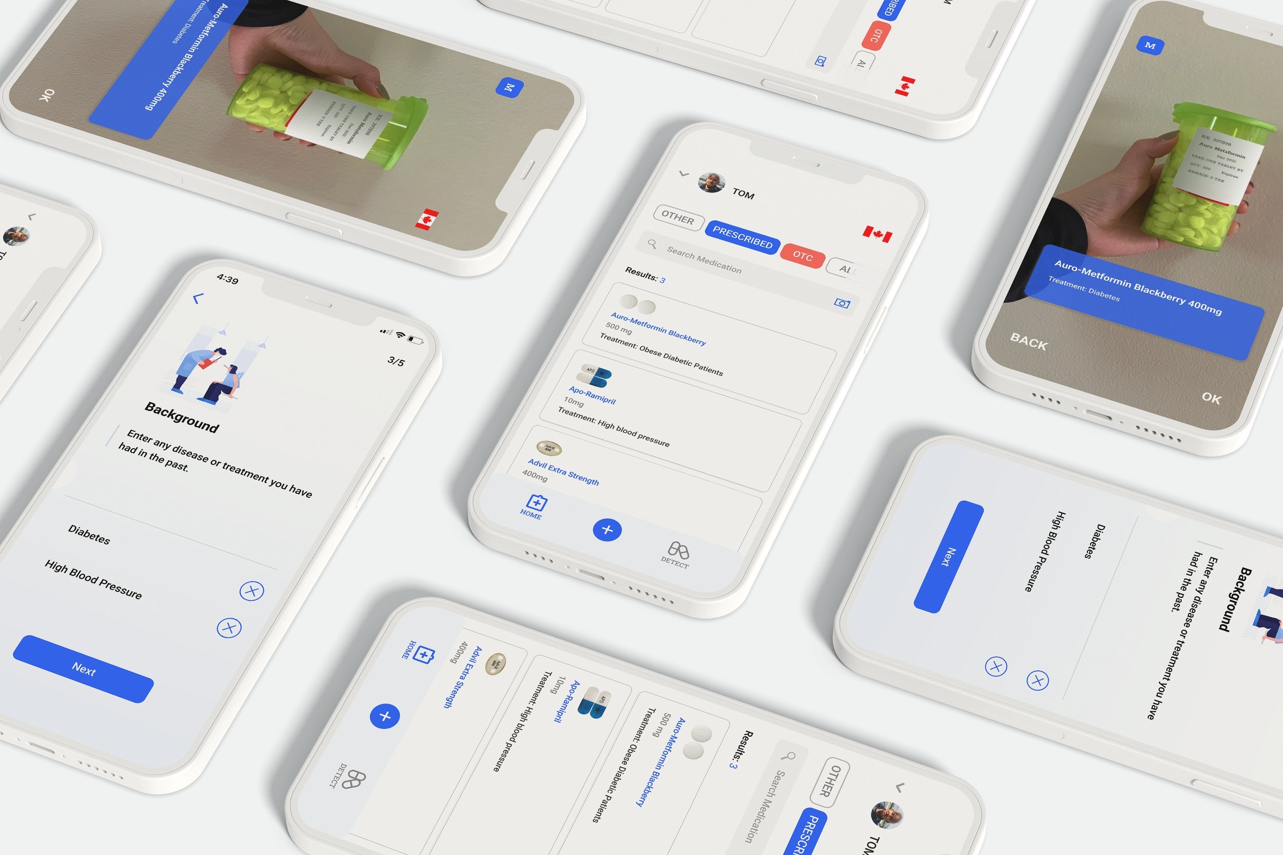
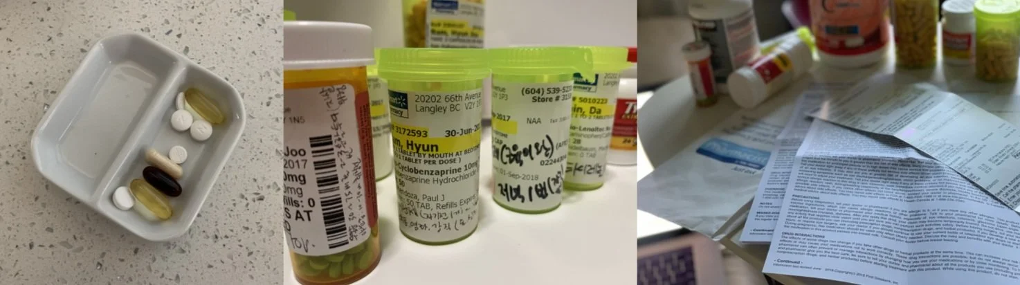
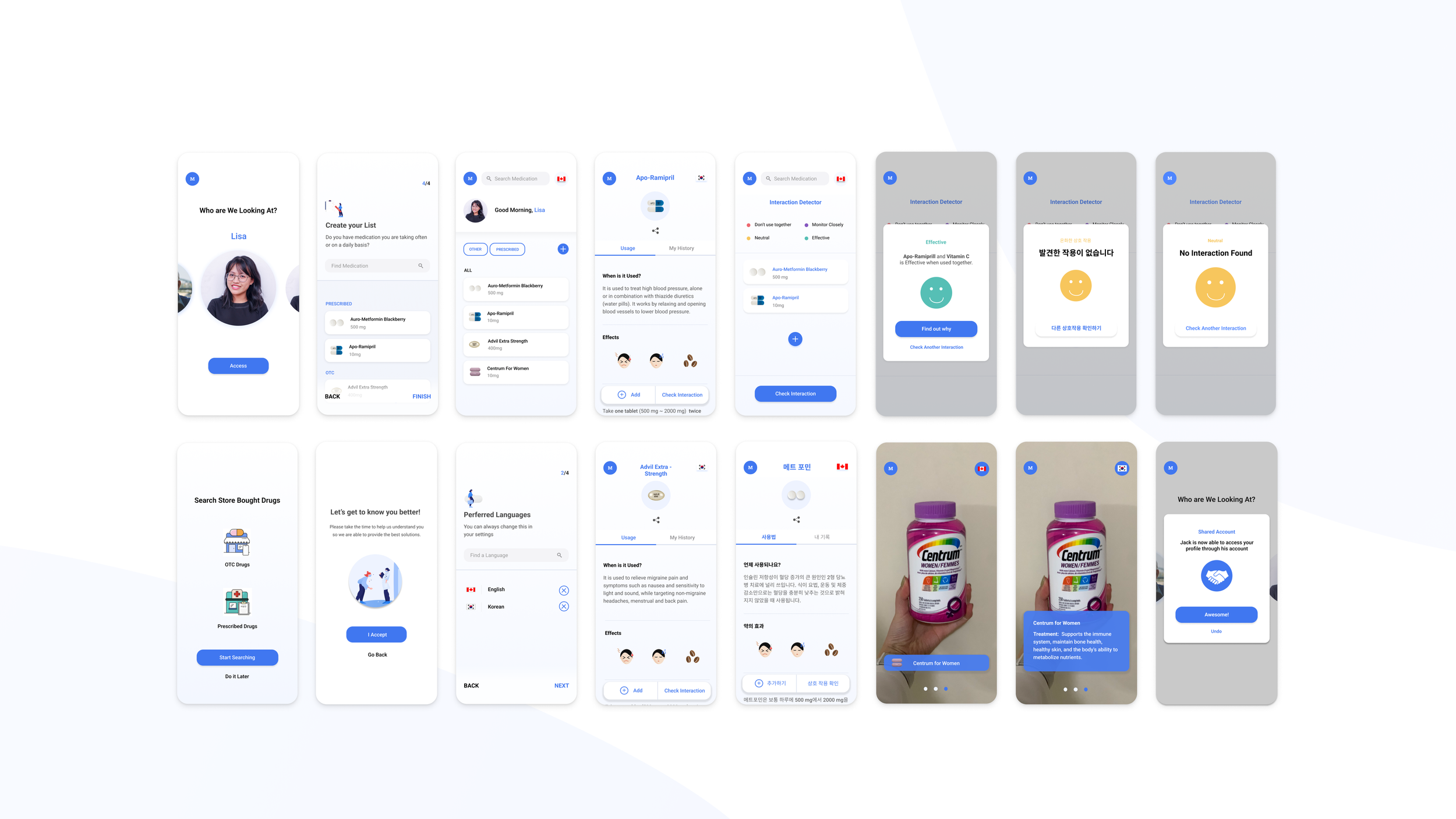
During Interviews, I was able to observe the entire journey from drug prescription to consumption. I noticed that many had developed their own methods for managing prescribed medications such as written instructions on pill bottles. However, relying solely on this became challenging due to the need for constant updates with each new prescription. This led me to consider an approach that integrates physical pill bottles, such as the idea of "scan and find."
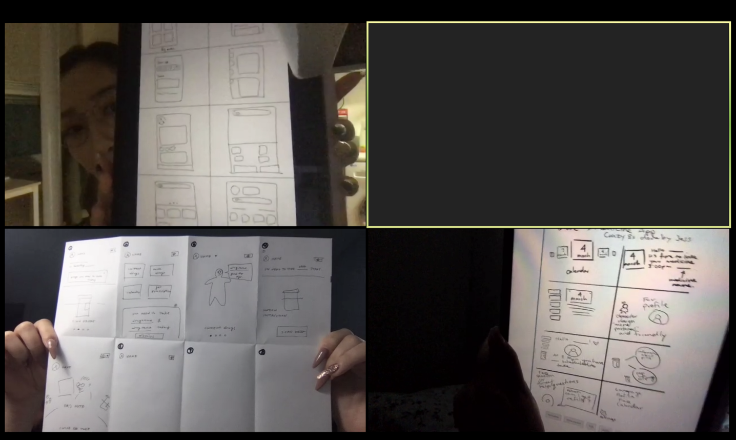
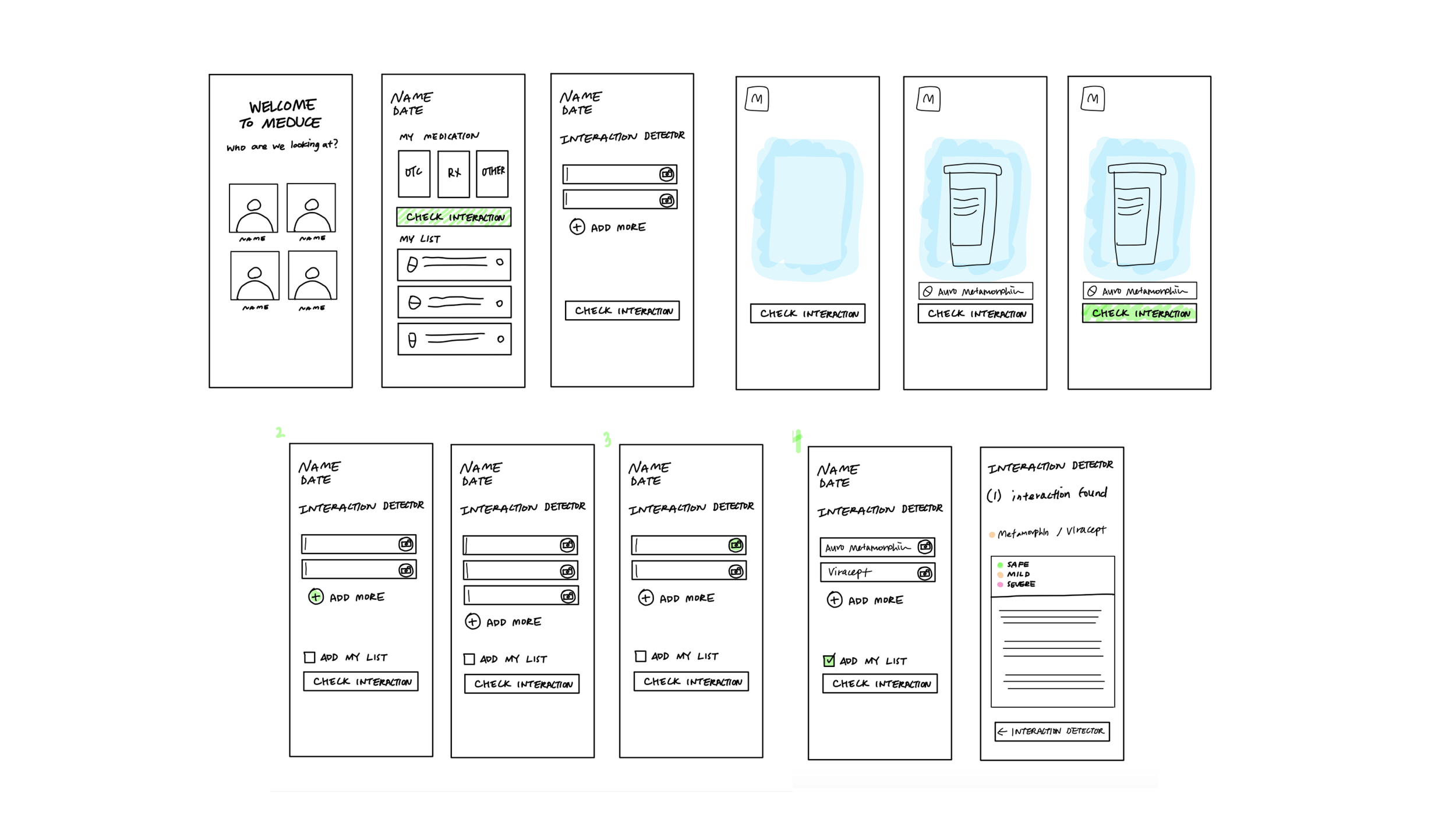
Ideation
I continued to sketch, collaborate, iterate and test to improve my design with feedback from peers, potential users, and mentors.
Outcome
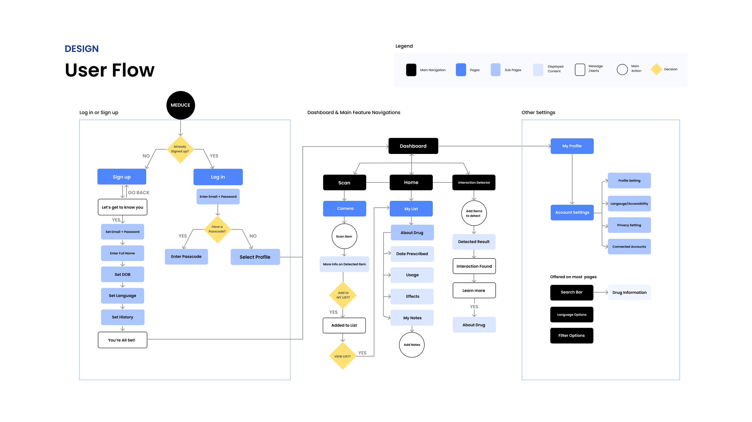
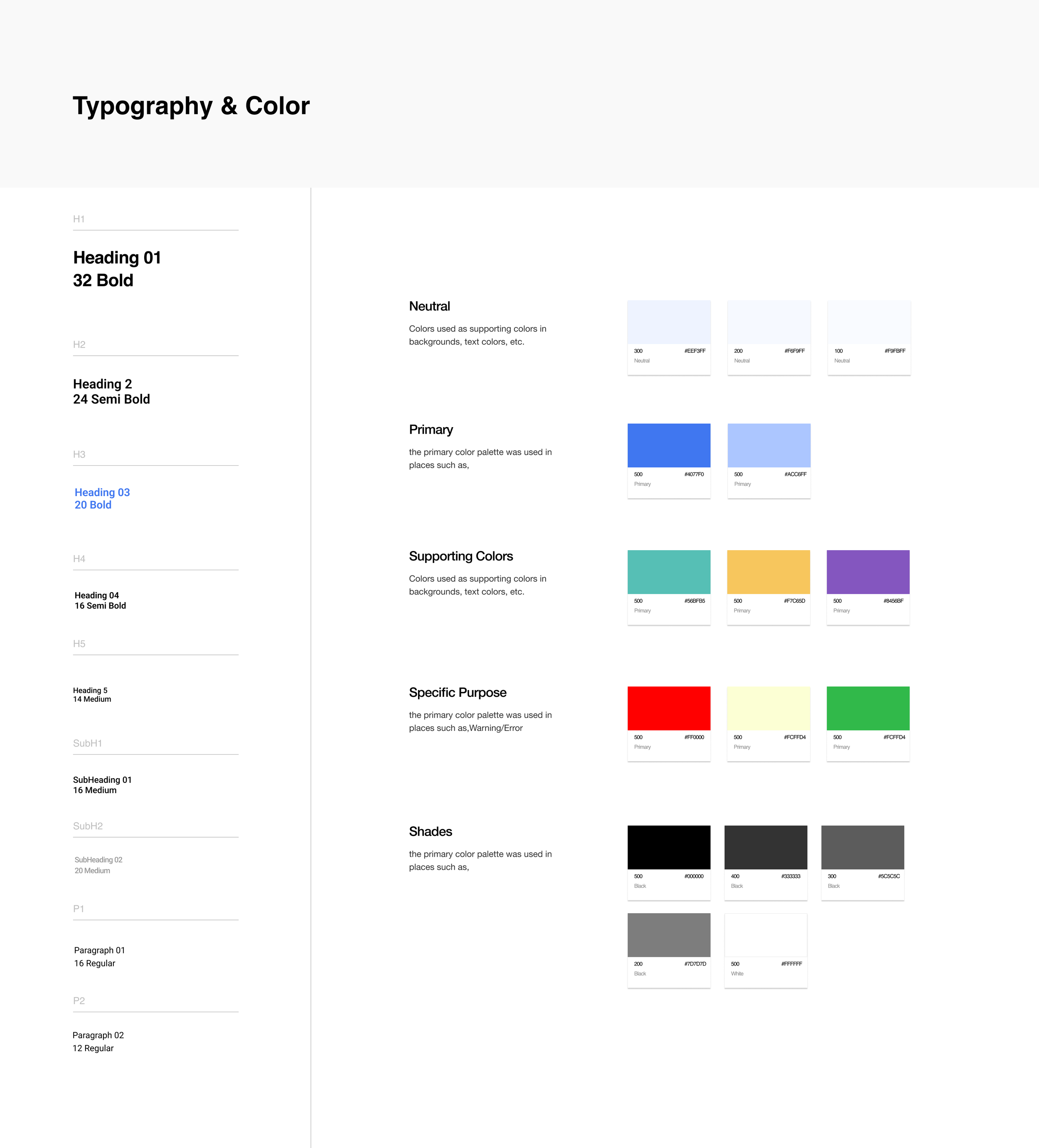
Meduce was designed to protect immigrants' health and enhance their access to healthcare services. It achieves this by providing medical information in an easy-to-understand format, using simple language, and incorporating visual aids. To optimize usability and accessibility, Meduce maintains a clean, simple, and consistent design language, allowing users to consume a significant amount of information effectively.
Final Thoughts + Key Lessons
A Design System is Essential - In the case of creating an app for managing medication and improving health literacy a well-designed system can help build trust and confidence among users using the app that can directly influence their own health.
User Involvement at Every Step - Throughout the project, I constantly reminded myself that "I am not the user," ensuring that I avoided making assumptions about what would or wouldn't work. Instead, I actively sought out input from actual users, valuing their insights and involving them in the design process.
Prioritize Depth over Breadth - At times, I found myself attempting to address every minor issue that arose, resulting in an overwhelming amount of information. While it is important to consider diverse user needs and reach as many people as possible, I made a conscious effort to stay focused and define what truly mattered to the user, guided by valuable insights.
Embrace Flexibility - As this project unfolded during the COVID-19 restrictions, both users and I had to adapt to new research and testing methods. This experience taught me the importance of flexibility and the need to navigate real-world situations as they arise, making necessary adjustments and remaining adaptable throughout the process.